Your cart is currently empty!

Page by Page: Your Homepage
For most websites, the home page is the most popular landing page, the most popular page, and the only page a lot of visitors see. And yet visitors may give your website only 4-12 seconds before they decide whether to stay or leave. Your homepage has to stand up and say, “Hi!”
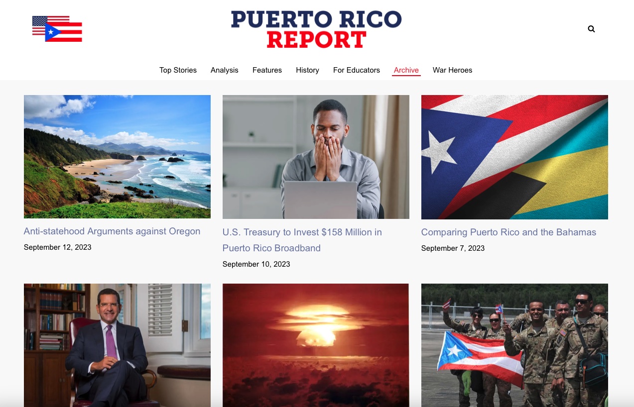
The example above, the home page for the Puerto Rico report, is visually arresting, but it also tells you right away what the website is about. If you’re interested in Puerto Rico’s status referendum, you’re in the right place — indeed, the best possible place on the web. Looking for cheap flights to Puerto Rico? You’re in the wrong place.
Your website’s homepage should be just that clear. If your visitors can’t tell instantly that they’re in the right place, they’ll leave. Then it won’t matter at all how great your website is. (Think you’re an exception to this rule? Read about exceptions to the rule.)
Your homepage on the SERPs
For many of your visitors, the experience of your home page begins on the search engine results page, before they click through. Make sure that your meta description gives a clear statement of what your site is about so searchers can recognize you immediately. The example below shows a case in which a Google search brought up two different pages of our client’s website. The meta descriptions make it clear which one is his homepage, and what he has to offer.


 A clear description means that your visitors will have more information when they click through, and will visit with more confidence.
Still, the way people interact with a website is very different from the way they interact with your company in the physical world. Typically, a visitor will have a question in mind when they arrive at your website: do you sell the ingredient they’re looking for, do you take their insurance, are you a wonderful place to hold the conference they’re planning — they’re not coming with a mind open to the myriad possibilities of your company.
They want what they want when they want it.
Your home page should be informative

Brick Street has all the basic information, quick and easy navigation to the registration information, and clear photos of their facility. Visitors can tell right away whether they’re in the right place for their needs.
This approach can be tough for marketers who are accustomed to print. You might want to have some mystery, to intrigue a visitor or to catch people’s attention. You might be completely focused on the look of the page or the branding. That’s not what people want when they are searching for information. They met you on the SERPs or when they read your blog post during their first information-seeking. When they come to your website’s home page, they want to know right away if you have what they want — and if so, how they can get it.
Look at your homepage. Can visitors tell immediately what you have to offer and how they can get it? If not, put that on your list of website improvements you should make as soon as possible.
by
Tags:

Leave a Reply