Your cart is currently empty!

Whose Website Is It, Anyway?
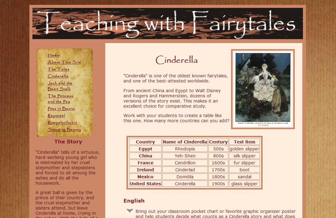
The screenshot here is a project I made for my first web design class. We were learning the languages used for web design, not anything about good web design, and we had a lot of rules for the assignment: it must include a table, there has to be a picture with a border, stuff like that. I picked the topic because I happen to own a lot of content on the subject, and I got an A on the project.
I know it’s not a great design, though. From the unreadable headline to my self-indulgent decision to use the Papyrus font (I like it, okay? No designer will ever allow me to use it, so I seized the chance), this is obviously a website designed by a non-designer. If that were my current website and a designer was going to update it, I would give him or her a free hand. I know my limitations.
It’s not always like that. Naturally, I’m not going to show you ugly designs people love, but the fact is that a lot of people do love their ugly designs, and want to hold on to them. Whether it’s an eye popping color scheme that they’ve gotten attached to or an ugly but expensive logo to which they’re committed, clients sometimes feel strongly about keeping their look. If I engaged a designer to update the website you see above but insisted that the header and colors remain as they are — well, lots of clients are like that.
How do designers handle it? Some refuse. Even if you don’t put your name on it, designer Sean Borsodi pointed out, some people will know you did it. Word of mouth is powerful.
Others see these situations as a challenge. Sean Sallings says, “It’s tough to not try to own the project. As a designer, I feel like I’ve got a pretty decent eye for what looks good, but part of the challenge is to take something that normally wouldn’t look attractive and give it some flair to make it so.”
As a client, how can you handle a difference of opinion with your designer?
- Choose a designer with a compatible style. If your designer’s portfolio is all corporate and you want cute, don’t hire that person just because he has the lowest price or the nicest office. We work with a variety of designers, so we make an effort to choose the right one for the look the client wants. Some agencies, however, have a single designer or a signature look.
- Listen to the suggestions. Some things are a matter of taste, but sometimes your designer is right. For example, there are proportions that the human eye naturally finds harmonious (see “The Golden Ratio and Your Website“). There are standard practices in typography that will look better even to people who don’t consciously notice the typography (see “First Thoughts on Typography“), and the knowledge of these things is one thing you pay your designer for. Don’t be so set on an idea that you can’t hear reasonable objections to it.
- Communicate clearly. You want red and purple? With kittens? You should be able to have it. But you can’t say, “Just make it look good” and then be upset three weeks later to find that you don’t have red and purple with kittens. If some things about your current site, or your list of ideas, or your personal preferences are actually not negotiable, say so. And make the effort to figure out what those preferences are, too. I dislike symmetry; I can say that, and a designer should understand what it means. “I want it to look nice” isn’t enough information.
by
Tags:

Leave a Reply