Your cart is currently empty!

Redesign: A Theater Company
We’re getting the finishing touches completed for a new website for the Pushcart Players, a theater troupe specializing in family audiences and school performances.
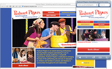
You can see their current website below at right, and the new one at left. The immediate impression is of course very different. Pushcart’s current site has been around for a long time and things have changed on the web: the technology, of course, but also the expectations of visitors when they come to websites. The old site really doesn’t express the quality and stature of the company.
Pushcart wanted to be sure to have the information from their old site at the new one: study guides, videos, photos, and descriptions of all their plays, plus a “donate” button, information about their sponsors, and their social media icons.
They wanted a playful, colorful feeling, and they wanted it to be easy to book a show so schools wouldn’t hesitate.
We wanted them to have an up to date, standards compliant website that would make people want to explore, and we wanted the content to be findable and readable. A lot of great content was hidden away in their old website. We also wanted them to have analytics so they could be strategic about increasing visits to their site, and good ways to capture visitors’ information for their mailing list. 
Designer Tom Hapgood created a happy, lively site that looks fun and exciting without being cluttered. The navigation is special and unusual, but also clean and easy to use. There were too many options before, and it was hard to get from one interior page to another without having to click back and forth.
There were a lot of treasures hidden in the depths of the old website. We made cool flipbooks from some old-school text games, embedded multimedia files directly into the pages, and put articles into a “News” blog section so it will be easy for the Players to add more when they feel inspired.

We’re building the site in WordPress so Pushcart can easily create pages that let them communicate internally. Password protected pages and posts let the company communicate with actors and schools easily.
Without analytics from the old site, we can’t gauge before and after results directly, but we’re guessing that busy members of the press will be more inspired by the new site and more likely to use the easy navigation to learn more about the company, so we’re hoping that the new website will help Pushcart Players with their promotional efforts as well as appealing more to their customers.
We collaborated with Pushcart on their content, making it more search engine friendly while maintaining their special voice.
All in all, it was a pleasure to work with the artists of Pushcart, and we’re looking forward to launching the site.
by
Tags:
Comments
2 responses to “Redesign: A Theater Company”
The new pushcart site is super! The new design pops! Great job everybody!
Thanks! I’m excited that it’s going to launch this weekend — I think the Pushcart troupe will really enjoy their new website.

Leave a Reply