Your cart is currently empty!

Very Fast Websites
Dr. Tom Hapgood is bucking for the title of Fastest Web Designer in the West, having beaten our previous record by having a site completed in less than two weeks.
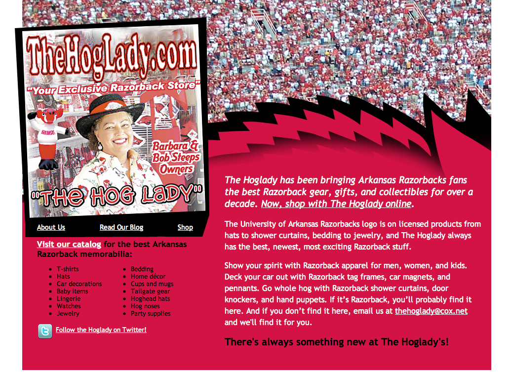
The website in question was built for an e-commerce shop featuring licensed products for the Arkansas Razorbacks, or local football team. The site owner had a brick and mortar store with these items for some years, and wanted to continue her business from retirement with an online shop.
The owner had had awebsite built by a friend, an IT worker who had only a rough idea of how webs design works. The website didn’t really look like a website, as you can see from the screenshot below. There were things about the website that the owner wanted to keep, though.
The image of Barbara Steeps, “The Hog Lady,” is a favorite poster of hers, and she likes the happy excitement it shows. Unfortunately, this layout doesn’t show visitors what this site is about or how to shop here.
It’s an ecommerce site, but visitors have to scroll waaay down in order to see a link or indeed any hint at all of the existence of a catalog. The content listed towns in which the client had previously had stores but now doesn’t, with just a quick mention of the online store and its contents — below the fold, for humans, and search engines would have to conclude that the list of towns was the important part.
The developer had pristine coding, and a well-built catalog, but the usability and search issues made this site unprofitable.
The new site is at the top of his post.
Tom kept the poster, but added a subtle Razorback (subtlety’s important for licensing reasons, but it also gives a sophisticated air that I love) and a crowd scene that works perfectly with Barbara’s poster. The poster is set at a jaunty angle that highlights the navigation.
The same design works for the About Us page, which sports a picture of Barbara and her husband Bob with their vehicle — a common sight around town on game day.
I’ve given her some keyword-rich content, too, so people will be better able to find her online. With a bulleted list of the most popular searches in the category of Razorback merchandise, this new design will give clear signals to the search engines and also let visitors see at a glance that they’ve come to the right place to get those Razorback shower curtains and hog noses.
Don’t worry if you can’t figure out the point of this. If you’re not a Razorback fan, you just wouldn’t understand.
The point, for the purpose of this discussion, is that we’ve gotten an exciting new look, a clear purpose and call to action, and a site that should do great things for The Hoglady’s business. We’re going to have Josepha do a linkbuilding campaign, and Barbara is using a blog to showcase new product and Twitter to keep in touch with fellow Razorback fans. Both her blog and her Twitter link are readily visible on her main pages.
What made this project go so quickly?
- It’s not a complete redesign of the entire site — we didn’t touch the catalog — but just of the pages that make the most difference for search and conversions.
- The clients had a clear goal, and we developed a clear strategy for them from the beginning.
- Rosamond, Project Manager on this job, insisted that we have all the images and information before we began. That let the clients sit back and relax while Tom and I did the work.
Does this speedy approach sound as though it might work for you? Call Julianne at 479.966.9761 to discuss your needs.
Related posts:
by


Leave a Reply