Your cart is currently empty!

Too Many Links in Your Text? view 2
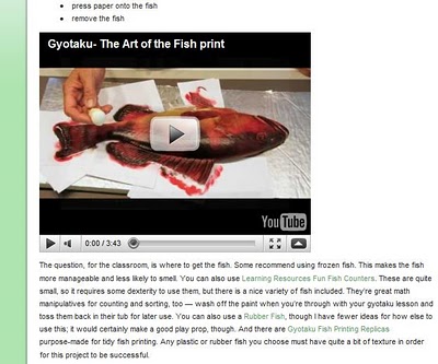
Yesterday, I wrote about the in-text outbound links at your website. If you do affiliate marketing, then some of these are ads. In the example here, the links to various kinds of fake fish you can use for gyotaku in the classroom all take you to a place where you can buy said fish. This is handy, it seems to me, for someone who wants to try gyotaku out with the kids but doesn’t care to bring actual fish into the school. These are, then, valid links according to the criteria we discussed yesterday.
Let’s get technical about the links issue, though.
Text like this, which allows a reader to get more information about the subject they’re reading by clicking and thus jumping to another site, is called “hypertext.” As in “hypertext markup language,” or HTML. HTML was initially intended to tell the computer where those hypertext links were supposed to go (which it still does, of course). It has gotten more powerful, but that was really the main point.
The idea was that people reading academic texts online (all that folks were imagining anyone would do online in those days) and encountering, say, the term “estivation,” could click on the word and go immediately to an explanation of estivation. Then they could quickly return to their main text, without interrupting the flow of their reading significantly.
Wasn’t that a great idea?
You do occasionally still see hypertext used in this way. However, it turned out that there were problems with it — and not just that people’s first thought was to link every third word to Wikipedia.
Studies done in the late 1980s and early 1990s, the infancy of hypertext, found that people randomly clicked around all over the place and didn’t get much studying done at all. This shouldn’t be astonishing. After all, these were people for whom hypertext was new. Small children just getting introduced to books are pretty random in their interactions with them, too. It takes time to learn how to use new technology. Still, the random behavior observed was just about the death knell for academic uses of hypertext. Or at least for the romantic ideas people started out with about such uses.
Later studies found that people reading hypertext learned and remembered less than those reading documents. Partly, this reflects a lower level of commitment to reading. If you bother to pick up a document, you’re probably going to read it. There’s nothing else you can do with it. Online, you can leave any time and go watch music videos. People are much more inclined to skim and scan online.
But it can also reflect the distracting nature of all those in-text links. Consider this when you’re using those links.
- Keep the numbers reasonable. I don’t have a number for “reasonable,” because it depends on the content, the audience, and the design of the page. I wouldn’t use more than one in a sentence, generally, or more than three in a paragraph. And if I have a paragraph with three of those links, it’ll be a while before another one comes up.
- Use design to help. You always should do this, of course. If you have a lot of links, make a bulleted list instead of crowding them all into an ordinary paragraph. I did that in the example below when I made a list of online gyotaku lesson plans. The link color is also compatible with the overall design of the page, rather than being the bright default blue.
- Test before you launch. This example comes from the FreshPlans educational blog. We know, from the language patterns of commenters among other things, that our audience is mostly in the 25-35 age group, so we tested this type of post with them before launching. Responses were excellent, and our subjects didn’t find the links distracting. I’m guessing that an older audience might find the link color difficult to read because it’s lower in contrast — one of the things that helps keep the links from being too distracting to our readers. If you test your page with your target demographic and find that they indulge in random clicking or seem to get distracted and lose focus, then you should change what you’re doing.
Once you launch, of course, you have your analytics, including both behavior on the site and response to the ads, to tell you how you’re doing.
by
Tags:
Comments
2 responses to “Too Many Links in Your Text? view 2”
good comments for anyone considering web pages. Thank you for those tips. I had followed every link in the referenced article and found some interesting information, however.
Thanks! I don't think the example article has too many links — it's intended to be a good example.
Have you tried gyotaku?


Leave a Reply