Your cart is currently empty!

Website Redesign Process: Mockup
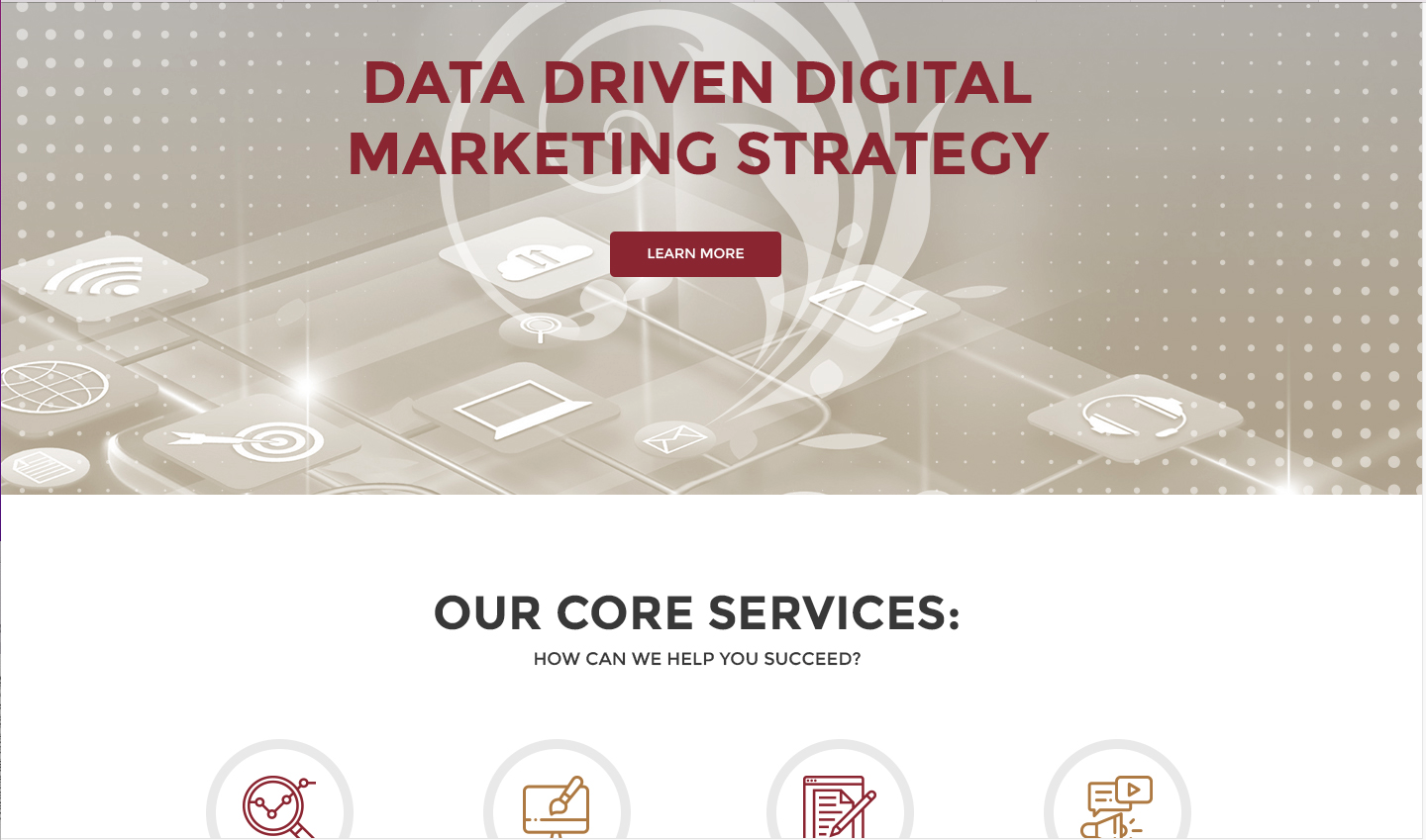
Delivery of the mock up is one of the most exciting moments of a redesign. A mock up is a picture of what the website will look like after it has been built. For Haden Interactive, a mock up is always the result of a lot of research, discussion, and thought.
But it is not a website. It doesn’t include the content that the finished website will include. It will have pictures as placeholders. It might have empty spaces where pictures will be in the future. It may have text in lorem ipsum, the Latin-like stuff designers use to get the look of real language without having the actual content available.
Since it’s just a picture, the menu and other links won’t work. Things can be moved around at this stage, so the placement of different elements is still not final.
 Ours, shown here, is a stacked design which will provide multiple screens for visitors who scroll. The “What we do and how to get it” section is above the fold, followed by “Who we are and where you can read/hear/find us,” and then a selection of our awards and mentions and testimonials. All the way through, there are interactive opportunities.
It’s recognizably our brand, but it’s a different look.
Exciting and confusing
But we know that the delivery of the mock up, while exciting, can also be confusing for many clients. They try to push navigation buttons and they don’t work, they worry about what the interior pages will look like, and sometimes they want to wait and see what everything looks like on the real website before they make changes.
This is a mistake. Many web firms charge extra for any changes after sign off on the mock up, and all web firms will do so if the time investment goes far beyond the original agreement. Making changes to the mock up is much easier than making changes to the website after it has been built — think of making changes to the house plan compared with making changes to the house.
Think of the mockup as the boxes you will fill with your content. Look from a distance and see how the overall look and feel seem to you. Think about colors, shapes, and the layout.
Don’t get distracted by details, but do ask for a look at different options. We considered a darker look, shown below. For client sites this year, we’ve offered multiple color variations, different kinds of spotlight boxes, multiple orders for stacked elements, and lots more.
Your designers should be happy to show you different options of this kind.
Make some decisions
Let everyone have a last conversation about the design at this point. Make decisions about navigation. Don’t get caught up in punctuation or little issues with content, because that isn’t settled, but your goal should be to avoid any design changes after approving the mock up.
In our case, we’ve planned some changes in the nature of the boxes and some of the colors in the stack. We have specific word counts in mind for some sections. We’ve figured out how we want the technical bits to work. Now the designer can build and the writers can perfect the content.
We often send website content in a Word document, putting the home page text into the mockup and waiting for approval on the rest before implementing it all into the website. It’s easy to change words later — especially in a WordPress site.
Make sure you love the design, though, before the website is built. The mock up is your opportunity to make sure all is well before the building begins.
by
Tags:


Leave a Reply