Your cart is currently empty!

Website Redesign Process: New Ideas
Every website needs updating every two or three years. The technology changes, the styles in web design change, and your business probably changes enough in that length of time that you need updates in content and images, if not in style.
We’re getting ready for our own redesign, and it’s high time since we’ve had the current design for seven years now. A lot of things have changed in our business, and while we still love the website, the look is certainly not up to the minute any longer.
I’d like to invite you to join us in our process. The way we approach our own redesign — when we do so many redesigns for other companies — might prove useful for you if you’re thinking about going through the same process yourself.
Brainstorming for a redesign
Our first step is brainstorming. Brainstorming about a web redesign — or initial design — can be great, bringing in lots of different ideas and perspectives. It can be an exciting, team-building opportunity for your company, and one that lets you think more deeply about your business and your customers.
It can also be a pain, as you try to fit together too many disparate ideas and get bogged down in discussions that go nowhere, or — worse yet — end up with a camel of a website.
We’re getting the best out of the brainstorming experience and avoiding the worst by doing these three things:
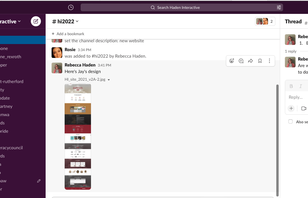
- Set limits. We set up a Slack channel, as you can see in the screenshot, where everyone can leave very specific comments on specific aspects of the website. This makes communication much easier than if we all tried to talk about, “that part in the corner, you know?” We don’t all have to be together in the same room at the same time (though we did have an initial discussion in a staff meeting) so that everyone has time for thoughtful commenting. And we have a deadline after which we won’t be doing any more brainstorming — a key to successful completion of the project.
- Don’t insist on consensus. We make a lot of decisions by consensus here at Haden Interactive. However, there are too many factors involved in web design to make this a practical way to approach things. Rosie has actually been startled by the sheer number of decisions that have to be made, and the amount of data you use. “Do you do this with all the clients?” she asked me at one point, as we discussed some fine detail. And yes, of course we do. But having to get input from half a dozen people to decide where to put the social media icons or how many banners to use in the gallery will not only make the process unreasonably difficult, but it also means that the various elements won’t work together in a cohesive way. Get input and listen to everyone, but leave the final decisions to one or two people.
- Keep clear priorities. Within our team we have a lot of different aesthetic preferences and different preferred ways of getting information. It doesn’t matter: we want a website that meets our business goals, not one we’d like to frame and put above the sofa. Sure, we’re expecting that the new design will look great, but we know the highest priorities for a business website are usability, findability, and the site’s ability simply to do its job.
With these boundaries in place, brainstorming can be fun, exciting — and useful.
by
Tags:
Comments
2 responses to “Website Redesign Process: New Ideas”
Well, it’s solid food for thought. Thanks for posting and sharing ideas. Other factors to consider: limited monies to make change, narrow points of input, and creative web/cyber insight blocked. I’m doing more reading and thinking before making the plunge again. In the meantime, will change photos and some of the text to ‘freshen.’
Resources can certainly be an issue, whether it’s money or time. Still, we have seen people jump in with a too-small budget only to need a redo soon after. They would have saved money by waiting to make the investment and being happy the first time. A content refresh is a good way to keep your site functioning while you work on the budget.

Leave a Reply