Your cart is currently empty!

Slider Images
As a general rule, we have banners designed for the slider or gallery when we build a website.
We build WordPress websites, so we typically have a slider picked by the designer of the site, we have specific pixel by pixel sizes for the banner images, and we convey that to the graphic artist along with the text.
But there are times when a nice big image is exactly what you want. Sometimes you have a product to showcase, and photos of that product are exactly what you need to sell your goods.
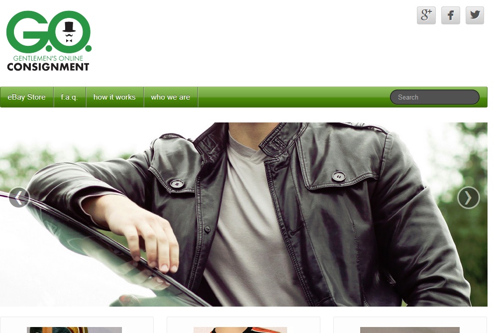
In the case of the website we’re building for G.O. Consignment, the site is all about men’s clothing — but the company offers a service, not a product. We need to convey the idea of upscale men’s clothing, not specific products.
How can you choose a photo?
- Go pro. Your snapshots might be charming at smaller sizes, but when they’re 1000+ pixels across, pictures need to be professional quality. Having said that, let’s also recognize that there are cases in which authenticity is more important than studio quality, as in the website we’re building for a nonprofit, which you can see in the screenshot below. A good camera and a smaller size for the gallery makes this work.
- Don’t mess with the shape. You can scale photos to a smaller size but you can’t put a square image into a long rectangular gallery. The photos you see in these examples were cropped to the right shape. Otherwise, they’d be stretched and odd looking, or the gallery would change its shape as the photos changed — neither of which gives a polished look to your website.
- Communicate. The images you choose for your slider will often be the first thing that catch’s a visitor’s eye, so they need to offer a clear message. Keep this in mind especially if your site is designed to pull in a featured image from your most recent blog posts, as is often the case for news sites, or for websites that focus on events or new products. If a visitor would be confused or misled by the image and it could cause them to click away, it’s probably not your best choice.
by
Tags:


Leave a Reply