Your cart is currently empty!

Should You Be Shallow?
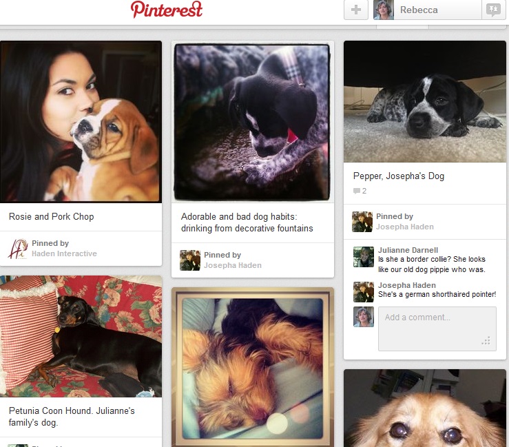
Rosie and I had a meeting with the nice folks at 8th & Walton today to discuss plans for next year’s social media. We were discussing Pinterest, and I showed Jeff, who is not very familiar with Pinterest, one of the boards we have at our company account: Our Dogs.
Rosie was aghast that we had a board like this. That’s her cuddling a bulldog puppy, and that picture has been pinned elsewhere by other people, too, because it’s just so adorable. She thought it was kind of a cheap trick.
“People like things like this,” I protested. “Nobody’s going to choose us to build their website because we have cute dogs, but people like to look at these things.”
The others at the meeting were courteously silent, but they looked dubiously at the board.
I told them about an experiment we ran recently. Our experience in social media, as well as the received wisdom from experts on the subject, tells us that people value useful and interesting information. But there is a school of thought that holds that a picture of a puppy with the caption, “Like this post if you like puppies!” is the pinnacle of Facebook content.
So we posted what we decided to call shallow content for a week. Photos of stuff with pointless questions, basically. Engagement soared.
Visits from Facebook to the website tanked.
The main point of social media is to get people to visit your website, where you have better control over your message and can really offer potential customers some valuable content — or maybe the chance to buy your stuff.
Coca-Cola has reported that social media chatter and Likes don’t in and of themselves lead to increased sales, though social media is still important. It has been confirmed repeatedly that people who like a brand page rarely return to it. Unless you have some actual communication going on, unless you offer something entertaining and valuable, you can’t expect your social media page to produce much. But it is clear that you can manipulate the apparent popularity of your Facebook page by posting “awwww” photos or cute sayings.
You could also hire people at Fiverr to push the Like button with the same effect, Jeff pointed out.
“I felt vindicated by this,” I said.
“I,” said Rosie, “felt that it proved that we should make our useful information look more like the shallow posts.”
She has a point.
You don’t have to be shallow. You don’t have to ignore the clear evidence that authority is better for many companies than cuteness. But you also don’t have to ignore the fact that people enjoy looking a pictures of babies and puppies.
Something like this, maybe:

The thing is, you don’t have to be shallow. Especially if you’re offering something that is the opposite of shallow, as 8th & Walton does. As we do. That doesn’t mean that you can’t show your lighter side. People don’t click through directly from social media to make a serious investment with a B2B service. As Jeff said, “We’re not offering a $10.00 pair of shoes.”
But people would rather work with people they like. If they feel, as Marie suggested, a sense of warmth about Jeff because of the pictures of his baby or about Rosie because of the picture of her with a puppy, then that warmth — combined with the evidence of expertise we provide through valuable content at social media sites — encourages them to choose Jeff or Rosie for their serious B2B needs.
Think how you can package your valuable content in a way that appeals to your readers visually. Why not provide warm feelings as well as answers to questions?
by
Tags:
Comments
4 responses to “Should You Be Shallow?”
“Think how you can package your valuable content in a way that appeals to your readers visually. Why not provide warm feelings as well as answers to questions?”
This is a great article and caused me to think about how I present my information and content, not just in social media, but also in presentations, curriculum, etc.
I also strapped a puppy to my head to see if it helps in my day to day interactions.
I’m with you — it’s a change in thinking that can really improve presentation in a lot of areas. And of course puppies are chick magnets… maybe a special hat designed to hold the puppy securely on your head would be a new CPG idea with legs. Next year’s Get on the Shelf contest sounds like the perfect launch for it.
Warm fuzzy dog pictures get a thumbs up from me. If you need a background image, why not keep it a happy endearing one?
p.s. New website layout is beyond outstanding 🙂
Oh, thank you, Ken! Tom did a great job. Rosie also gets credit, because she’s the one who articulated the business goals the website needs to meet, so we could align the design goals with the company goals. We’ve seen an amazing lift in conversions since the redesign as a result.

Leave a Reply