Your cart is currently empty!

Pitfalls of Website Meetings
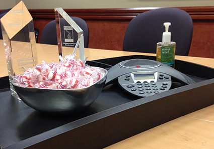
I was first into the conference room yesterday for a meeting with a marketing director and a passel of engineers, so I had time to look around the room. On the table was a tray containing some awards, plus candy and a bottle of hand sanitizer identified as “Stress Relief” hand sanitizer. The unintended implication was that meetings in this room would be stressful enough to require aromatherapy and sugar, not to mention clean up.
This was not the first meeting I’ve been to with this client, so I knew they were great people and no aromatherapy breaks would be needed, but it did make me think about the nature of meetings about websites.
A lot of time is spent learning about your company, and a lot of pointed questions about your consumers and your competitors will be asked. Your web team will mostly listen. They’ll go away and have their own meeting, and get back to you with a mock up — a picture of the new website design.
Here’s where things can go awry. See if you recognize any of the following pitfalls:
- Too many cooks. It makes sense to have just two or three decision makers — or one. Beauty is in the eye of the beholder, and it can be nearly impossible to get consensus in a larger group. If you manage to get agreement from a large number of people, it is often at the expense of the functionality of the design or the site architecture. The more people you have as decision makers, the more likely you are to end up with a camel when you really want a horse. The solution: decisiveness. Make a firm decision about the overall look and feel of the mock up before you hold that meeting.
- A storm of suggestions. Some people feel that they have to speak up, because they’ve been invited to the meeting. Sometimes this results in a request for a slightly different shade of yellow here or a change in icon there, and that’s fine. But sometimes there are half a dozen conflicting ideas about how to change or adjust things, and they are not compatible with each other or with the goals of the website. The solution: specificity. If you let people know that the mock up has been approved, and now you’re looking for errors or omissions, you’re more likely to succeed in getting only the most substantive feedback than if you leave it wide open.
- Nothing now — lots later. Sometimes the people at the meeting haven’t been involved in the planning and just accept the design because it looks good. Later, after the site is built, they realize that their department isn’t in the main navigation or that the tables of specs are outdated. The solution: preparation. If you can send mockups to the relevant people before the meeting, they’ll have time to catch important issues before the meetings and think about how to explain those issues clearly.
In the meeting I just attended, we learned that the company does design, not just implementation. That’s extremely important, and it’s very good that we got to know that before building the site. We know what to do next and that means we’ll be able to stay on schedule
Don’t worry about hurting your web team’s feelings, but be as thorough and specific as you can with your feedback. Once a mockup is approved and building begins, there are costs associated with making changes. You may pay those costs or your web team may have to absorb them, but either way, your meeting about the mock up is designed to avoid them.
by
Tags:

Leave a Reply