Your cart is currently empty!

Pantone’s Color of the Year 2024: Peach Fuzz
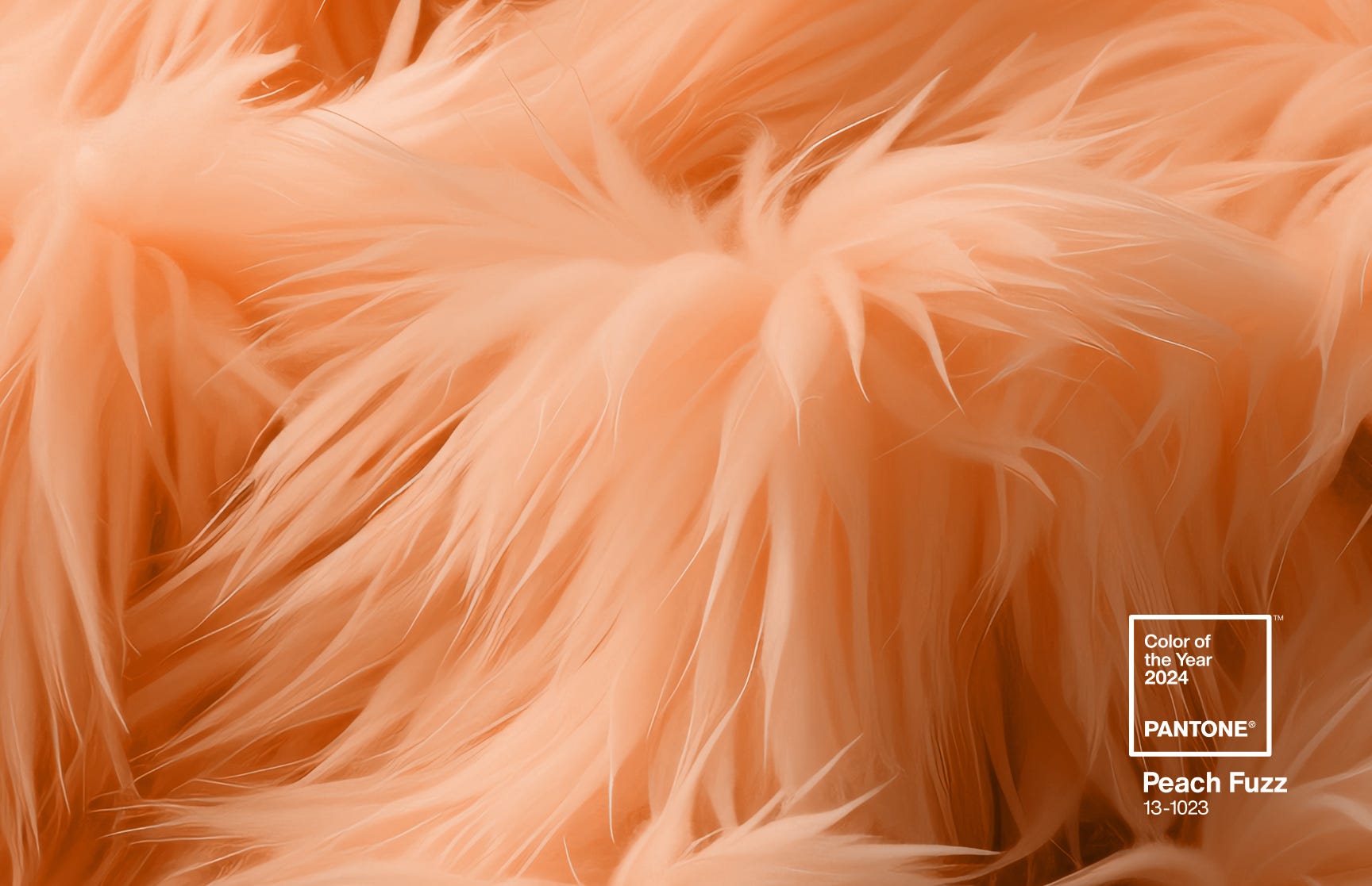
Pantone, the international color experts, have announced their Color of the Year for 2024: Peach Fuzz.

This is a nice shade of peach. Peach is essentially a very pale orange, so it has a sense of warmth, energy, and friendliness. Peach is less aggressive than orange, though, and may be considered more upscale. Pantone is never satisfied with that kind of description of a color. They put it like this:
“PANTONE 13-1023 Peach Fuzz captures our desire to nurture ourselves and others. It’s a velvety gentle peach tone whose all-embracing spirit enriches mind, body, and soul. In seeking a hue that echoes our innate yearning for closeness and connection, we chose a color radiant with warmth and modern elegance. A shade that resonates with compassion, offers a tactile embrace, and effortlessly bridges the youthful with the timeless.”
Either way you care to describe it, it’s a nice color. Some of the Pantone Colors of the Year take time to get used to and don’t appeal to consumers until several months in. We don’t expect that to be the case for Peach Fuzz.
Peach-colored websites
It’s generally easier to use peach than pink at a website, but it can have the same feminine impression. if you were considering a pink website but weren’t sure you could pull it off, peach is a good alternative.
We built a peach website earlier this year.

This site uses complementary colors. Since peach is a pale orange, its complement is blue. Complementary colors provide the strongest contrast, and give an energetic yet harmonious effect.
This infographic uses peach with orange and blue.

Josepha’s podcast also mixes peach and blue.

Pantone is also combining Peach Fuzz with lavender, yellow green, and burgundy.
We expect to see more peach shades in websites this year.
Previous Colors of the Year
Pantone’s Color of the Year is probably the most profound influence on color choices in the design world. The top color doesn’t always make its presence felt in web design, but it has sometimes in the past.
by
Tags:

Leave a Reply