Your cart is currently empty!

New Website for Wellness Organization
The Center for Conscious Eldering is an organization that supports people in the third act of life — from age 50 to age 90+. Their focus is on physical, social, and spiritual wellbeing, with a product line including workshops, retreats, custom programs, coaching, and a book by their founder. They had a well-established website which they liked very much. However, their webmaster was retiring. He had built their old website, and as is so often the case, it was not designed for easy management by anyone else. The retiring webmaster recommended that the CCE have a new website built in WordPress.
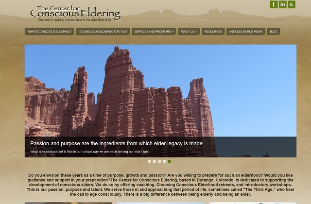
We were delighted to work with the CCE to create their new website. Our goals for them included increased functionality, greater findability, and an updated look that honored the original website. The original website, shown in the screenshot below, was not responsive or mobile-friendly, had a dated appearance, and was hard for the owners to update. The new site, shown in the screenshot above, kept the brand but fixed the problems.

Homepage
This was a very collaborative project, with CCE founder Ron Pevny working closely with me and our designer, Jay Jaro, to make best use of the Center’s assets. We showcased Ron’s beautiful Southwestern photos in a slider and spotlight boxes on the homepage. Below the fold, CCE can use pulled-in posts to present upcoming events, featured resources, and new blog posts.

Interior pages
We created an events page which automated much of the effort of keeping program information up to date. The CCE team can add new events by simply filling out a form, and the events drop off when they’ve taken place. There’s an easy search function, and clear registration instructions in a sidebar.

Individual event pages contain basic information, including an interactive map. Eye-catching buttons let visitors integrate Google calendar and iCalender. But these pages also allow visitors to download and print out a flyer, which may be the preferred action for the CCE’s population.

Throughout the planning and build of the new website, we were able to use data from the original website, our knowledge of best practices for user experience, and Ron’s deep knowledge of his particular niche market to make sure the experience will be excellent for his visitors.
We created a gated page for Ron’s articles, again with the option of reading web pages or downloading a PDF file.

Visitors can enjoy several articles, and then fill out a simple form to reach the rest of the content. This low-pressure method of growing the CCE house mailing list has worked well for CCE for some years.

The sidebar contains additional calls to action, as well as rotating testimonials.

We optimized the existing content for search and added a couple of needed pages without changing the message or the tone of the CCE’s content, and used their many authentic photos throughout the website. Visitors will be able to get a clear idea of what training and retreats with CCE are like, while CCE will be able to reach a broader audience.We were also able to gather multimedia from across the web; in some cases, we added it to the new website, and in others we linked to it. Either way, we were able to provide a consistent look.
The user-friendly WordPress CMS will make it easier for the CCE team to make their own site updates, and we built the site with easy in-house updating in mind.
Big takeaways
The project was a pleasure. The most important things CCE brought:
- A clear understanding of their target audience
- Strong brand awareness and clear communication of their preferences
- Their strongest assets: in CCE’s case, great photos, compelling content, and an excellent team
If you have these things prepared, your new website or redesign is destined for success.
by
Tags:

Leave a Reply