Your cart is currently empty!

A Makeover for an Engineer’s Website
We built a WordPress website for a local industrial engineer last year, a redesign of one of three he owns. We added regular blogging, too. The results inspired him to have us redesign a second website this year, with the third coming up.
We’re delighted to expand our partnership with this client, and delighted also to have the opportunity to update a website that certainly deserved a fresh look.
The old website had been around for a long time. The code was updated a couple of years ago and we updated the content for him at that time, but no changes had been made in the design, so it definitely had a retro look. Since the client wanted to add a blog, too, it made sense to build the new website on the WordPress platform.
Here’s the website as it appeared on Friday:
While the site did its job — providing the phone number industrial engineers would need to get service fast — it didn’t have the look or the functionality web visitors expect now.
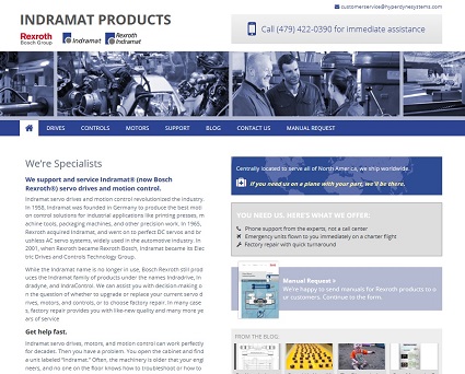
Our client actually likes a retro look in websites, and gave us a screenshot from the Wayback Machine as inspiration for his new website. Designer Tom Hapgood was able to interpret the 20th century vibe in a new way for the 21st century website:
The new website still has that all-important phone number right where it’s needed, and it also has optimized content, a blog (posts are pulled to the front page with a grid display), and a secondary call to action on the homepage to encourage visitors to develop awareness of the client outside of emergencies.
In addition to standards-compliant responsive design, the site has a big red call to action on the mobile version. Many of the client’s calls come from a flustered engineer on the factory floor, so chances are good that mobile visitors are in an emergency situation. The mobile version of the website responds to that urgency.
We’re looking forward to seeing the results of this website, too.
Related posts:
by
Tags:


Leave a Reply