Your cart is currently empty!

Your Logo Wardrobe
Starting a new business? Rebranding? Getting online? Then you’re probably planning a new logo. Do yourself a favor and look ahead when you have your logo created. You really need a logo wardrobe.
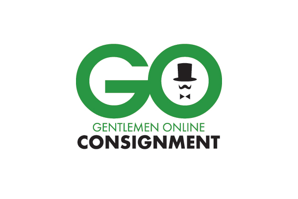
At right you can see the new logo Jay designed for a new business, Gentlemen Online Consignment. When the client came to us for a new website, he had a logo but wasn’t happy with it. It was a generic shield with the company name in hard-to-read Olde Englishe lettering. He had a JPG file — an image file — and nothing else.
We’ve also had clients come to us with a logo only in PDF format, the file type used for print and for web documents designed to be printed out.
This is the first consideration for your logo wardrobe: file types. Your logo should come in these forms:
- PNG, the format that allows transparency. This is what lets your designers put your logo on a background without having a white box around it.
- EPS, a vector file. This type of file allows the logo to be used in any size, from business cards and web sites to billboards and trucks.
- PSD, a Photoshop file. This may not be needed, but a layered Photoshop file makes it easy to make small changes to your logo in the future, even if your original designer is no longer available.
You will also need to have your logo in color variations:
- Grayscale or black will look better in black and white than your color logo. While your company may use color even on invoices, there may be times when you need to use black and white, or when you choose to do so for savings. A grayscale logo is designed to be used in black and white, so it will make a better impression. We like to have grayscale, black, and white — because you never know how you may want to use your logo in future. Having these variations created along with your original logo is more cost-effective than having it done later when you need it.

- You’ll also need a reverse color version of your logo. If you’ve designed your logo to look good on a black web page, you’ll also need a version of it which will look good printed on white on a brochure.
Finally, consider the shape of your logo. The logo we’ve been looking at is suited to horizontal or vertical spaces, and will look fine in a square shape or in a circle (as at Google +). However, if your logo is horizontal, get a variant that will work well vertically.
For example, the logo below — one of the options Jay created — looks great in horizontal settings, but won’t work in other orientations. If the client had chosen this one, we might still have wanted to use the design shown above for social media avatars.

Discuss the logo wardrobe you need with your designer when you have your logo created and avoid the expense of having it redone later.
by
Tags:

Leave a Reply