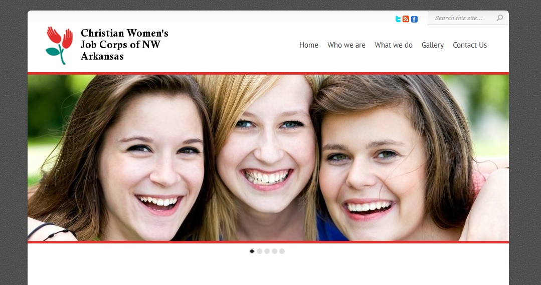
Josepha and I have been examining websites recently in the course of developing strategic recommendations for the Quarter 1 analytics reports. She has several times said, “It’s not an attractive website,” and I’ve sort of thought, well, yeah, okay, so what?
I mean, I like a beautiful website. If I would enjoy putting a screen shot on my wall to gaze at while searching for the perfect word, I think the designer has done a good job. But when people have a website already and we’re looking at challenges and opportunities for SEO and conversion optimization, it seems almost petty to say their site’s not pretty enough.

Sometimes it matters a lot, though.
Here are the before and after pictures from one of the projects I worked on at NWAGiveCamp. The Christian Women’s Job Corps had a website, and you can see its current homepage (as of this writing) below.
The site had plenty of information about the charity, but it wasn’t written for the way people read online, which is different from the way people read print. It wasn’t optimized for search, though just having plenty of content is a great step in that direction. There was a real emphasis on “who we are” and “what we do,” when the truth is that most visitors to any website are thinking about themselves. Visitors to a nonprofit’s website may be thinking, “Would this be a good fit for me in terms of volunteering and donations?” or “Can this organization offer the kinds of services I’m seeking for that woman I saw at the bus stop?” but they’re still thinking about themselves.
The code was not lovely. The site owners were able to keep it current, and they did — and boy, do I ever admire them for that, since they’re all volunteers — but it wasn’t easy and they didn’t really have control over all the aspects they needed to control. 
Perhaps more important in this particular case, the design of the site didn’t communicate the spirit of the organization at all. The volunteers and sponsors of this nonprofit are kind, dedicated women who provide a happy, supportive place for women in need to learn the job skills and life skills that can lead to self-sufficiency in their lives. Does the site at right show that? I’d say it doesn’t. The colors are somber, the layout is severe, and there’s no hint of all the sweet smiles we saw in the members of this charity.
Angela Belford of the Belford Group donated the Chameleon theme from Elegant Themes as well as a whole bunch of stock photos, Beau Poytner of CarMart and Brian Neumeier of Consumer Testing Labs supplied the development skills, Beto Tinoco from Walmart ISD spearheaded the graphics, Karen Strain from the University of Arkansas kept us on track, and we built the nice new website that you see at the beginning of this post.
Sure, the content is better, the code is better, the usability and functionality are improved. I’m betting, however, that the new site will give visitors an immediate “I want to be involved with this” feeling far more often the old one did. The organization wants to increase the number of volunteers and sponsors, and an immediate positive feeling about the organization should make a real difference there, even before visitors get to reading the text or looking for a donation button. Sometimes a good-looking website is essential.


Leave a Reply