Web design

The Quest for a Logo
We’ve been planning some multimedia updates for Customer Dynamics, a tech company providing custom CRM installations for SMB clients in the West. At right you can see the new logo we made for them, and in the post below we run through the process.

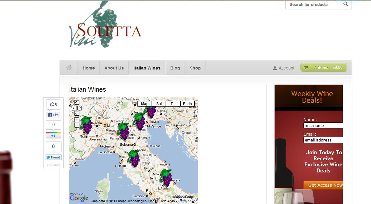
Add an Interactive Map to Your Website
We’re working with Brent Wehmeyer of KC Local Online on a new website for Vini Soletta, the import business of Italian winery Tenute Soletta. Their existing site has limited content and doesn’t come up well in a search for their company name, even though they are a well established company which has been providing imported…

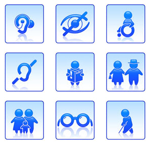
5 Easy to Miss Accessibility Issues
Making sure that everyone has access to your website is important, just in principle. It can also be important for the bottom line at your business. When your site is hard for prospective customers to read, they’ll go elsewhere — people have lots of choices online.

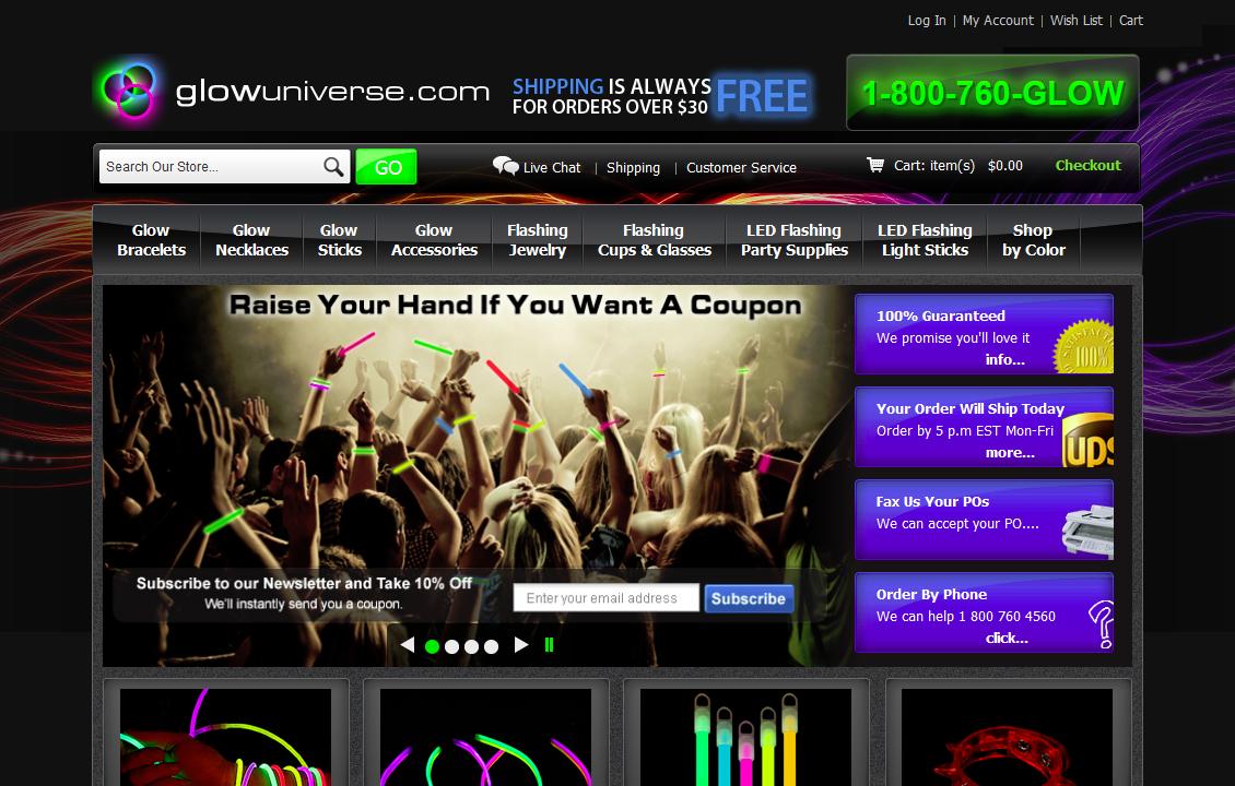
The Light on Dark Website
Generally speaking, light text on a dark background is not a good idea. For anyone with limited vision, and for most people over 55, it’s hard to read. Since our goal is generally to get as many eyes as possible reading our websites, it’s clear that white on black isn’t the ideal — nor, as…

The Unplanned Website
Designer Tom Hapgood and I sat down yesterday to plan a new site we’re doing for a dentist who practices in an art gallery. Pretty cool, eh?

Visual Clutter at Your Website
Does your website suffer from visual clutter? This gas pump sure does. There are so many options here that the user has to stand and stare to figure out what to do. There are a lot of things that look as though they might be things to press in order to pump gas. There are…
