Web design
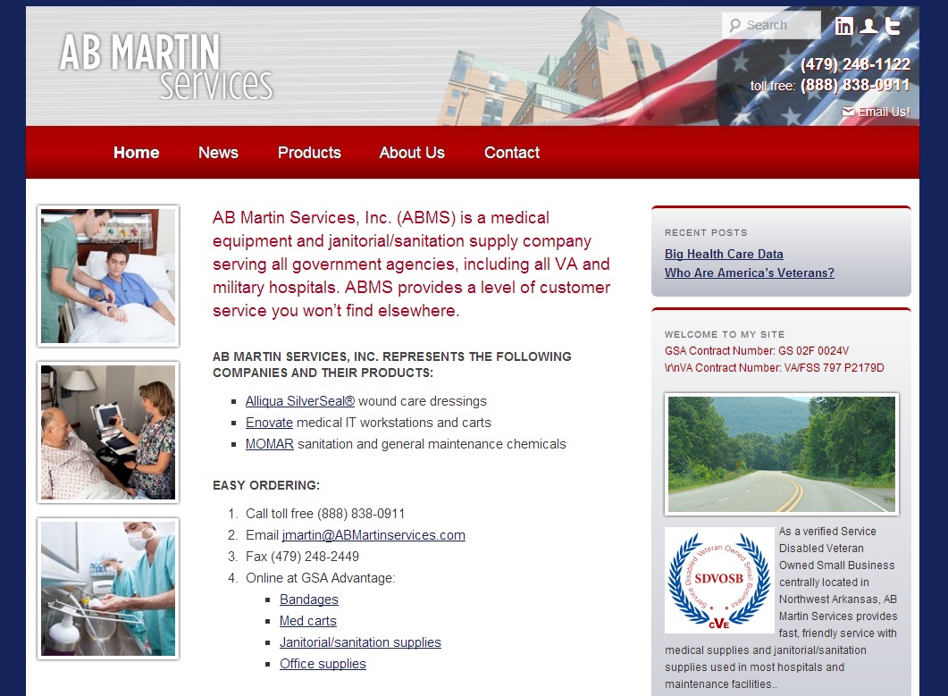
Make Your Company Stand Out
Here you can see a screenshot from a new website we’ve just launched. The site came with some interesting challenges. This site belongs to a medical supply company serving government agencies, particularly Veterans Administration hospitals.
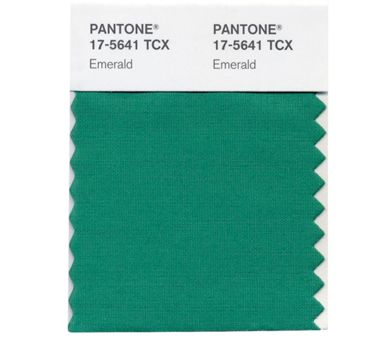
Color of the Year 2013, Revised
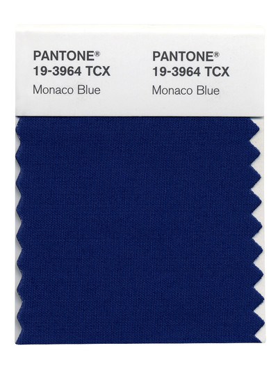
We announced that Monaco Blue was Color of the Year 2013 back when, well, everyone else was announcing that. However, it appears that Monaco Blue was only a “top color.” The Color of the Year for 2013 is actually Emerald.
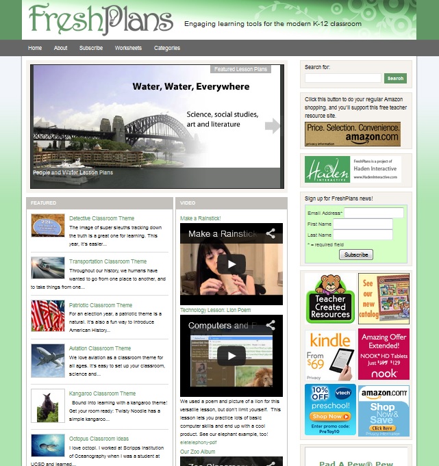
Should Your Business Site Have Ads?
We’re currently building a website which offers a service to professionals. The site owner is wondering about having ads on his site. Should he do it, and if so, when and how should he put ads on his website?
Iterations vs. Options
Iterations are successive changes to one idea. Options are choices among multiple ideas. Which is a better way of creating a design? Some web firms create several options for you and you choose one. Often, this is more a matter of picking among pre-made templates than of having three new creations, but that depends on…

Page Size Growth: What It Means
It has recently been reported that the average web page size has tripled since 2008 — and perhaps more strikingly, that the average web page’s size has increased by 20% in the past six months.
Blue Websites
Here it is, a Top Color for 2013: Monaco Blue. The blue (presumably) of the sea off of Monaco, the blue of a film star’s eyes, the blue of approximately 527 million websites. I made that number up. However, unlike 2012’s Tangerine Tango and 2011’s Honeysuckle Pink, it will certainly be no challenge to find…
