Recently I’ve been doing some writing for a health and beauty supplement company in Malaysia. I’ve done quite a few health and beauty sites in Europe, Asia, and the United States, so I’m pretty familiar with the genre.
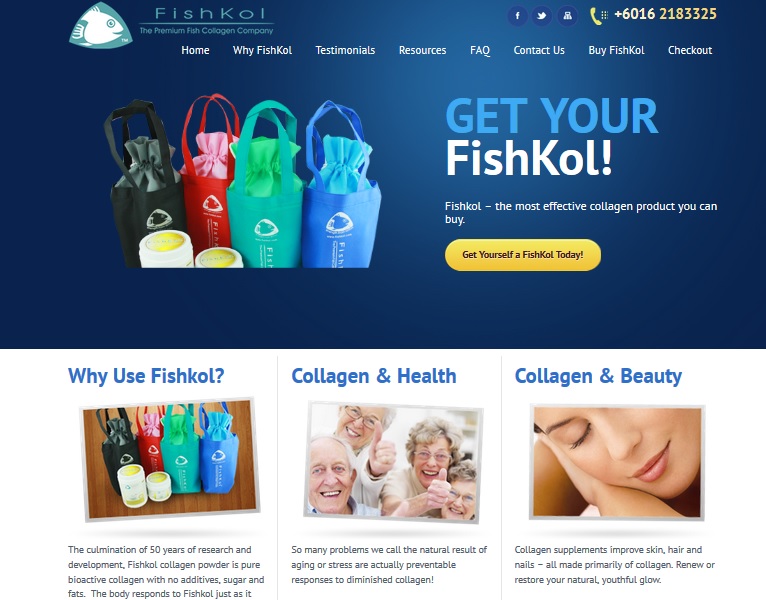
When I saw their new design, by their local guys at SweetMag, I was impressed. The work in progress screenshot at right shows a nice, modern WordPress business site — not at all the norm for the players in this space.
We’ve written before about having a design very different from the competition. Sometimes it’s not a good idea. Sometimes it’s a great idea.
Looking very different from your competitors can prevent people from realizing what you do. In those first few seconds when visitors decide whether or not to stay and read your website, they can fail to grasp that your retro diner-themed website is offering auto parts, for example, and they can leave.
When you have a very clear offering, though, a really different look can make you stand out from the competition.
FishKol’s competitors have some very characteristic styles:

The scientific supply company look.

The “We haven’t updated our site since the last century” look.

The beauty parade look.

The magic potion look.
In general, there’s either a scientific (or would-be scientific) chemical company look or a very girly vibe (with optional grimacing doctor). In general, the sites look somewhat old-fashioned and rather clinical, even when they are up to date and well designed.
FishKol took another approach.  Instead of sticking with either a medical or a just-us-girls theme, they chose to use multi-ethnic photos of active people.
They chose a deep blue color scheme that reminds us of the nature of their product (fish collagen) and added fun graphics to all but the most research-oriented pages.
This certainly distinguishes them from the great mass of nutraceutical supplement providers, as well as the mass of “beauty drink” manufacturers.
(A note here, for American readers who have never heard of this. Beauty drinks, which are usually sugary drinks for women that promise things like a larger bust or lovely skin, are very popular in Asia. Coca-Cola and famed Japanese cosmetics company Shiseido apparently collaborated on one of these drinks, called “Lovebody.” Some of these concoctions also contain fish collagen. )
What are the benefits of stepping out from the competitive field?
One is that you can position yourself to appeal to a different audience.

I don’t want to make too many unsubstantiated claims about what this particular example can do. They hired me for my English, not my marketing insights into Malaysian consumers. However, I wouldn’t be at all surprised if this new look didn’t give FishKol the ability to appeal to guys as well as girls. I’m married to a Southeast Asian man and I think he would be hesitant to order a beauty drink from a petal-pink website, just as your typical American man would. By focusing on the benefits for athletes and the anti-aging effects, FishKol can reach an additional audience of health-conscious men. If you want to reach out to a different kind of consumer, a different look could help.
Stepping out of the box can also give you the opportunity to differentiate yourself from your competitors in meaningful ways.
One of FishKol’s claims to fame is that — unlike beauty drinks — their supplement is pure collagen. The same may be true of the products that choose a chemical company look, but they have less appeal for typical consumers. FishKol can (and does) offer recipes for protein shakes and hints on how to use their product that sound like the tips you’d find at a fitness website.
Visitors to a more clinical site won’t expect to find that kind of content. On the web, what you expect has a lot to do with what you actually find. Visitors don’t usually stick around and search for surprising nuggets of information — they see what they expect, or they leave.
If you decide to follow FishKol’s example and build your site with a different look, consider these points:
- Focus on quality. FishKol’s new website is up to date and attractive, with text written in natural English. This makes their site not merely different from most of their competitors, but actually better.
- Make sure that visitors can tell at a glance what you do. FishKol’s new site makes it immediately clear what they have to offer and how you can get it.
- Base your new look on a strategy. FishKol’s site design says “marine collagen” and “health and beauty,” “fitness” and “anti-aging.” Their design is original but not wildly off target for sites in their competitive space. Choosing a look for your website based just on what you think looks nice, rather than on a point you want to communicate, would be a bad decision.


Leave a Reply