You have a blog, right? You can always name it News and use it to share things you want your visitors to know. But sometimes you want to showcase your news on the homepage. There are many good ways to do this. Here are a few used at sites we’re working on right now.
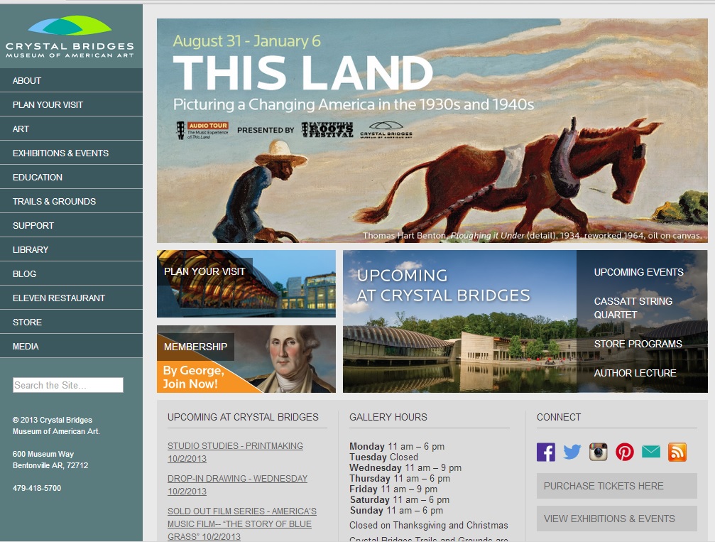
Both Crystal Bridges Museum of American Art and FreshPlans use easily-change featured content banners to show the current news, whether that’s the current exhibit or the current lesson plan focus. If your theme uses a rotating banner or slider, this is a perfect way to showcase your news.

Another easy way to use featured content is to pull the most current blog posts onto your home page. We build this feature into many of our websites, and you can use Featured or Sticky categories on your posts to make certain that your news stays visible on the homepage. Here’s an example of this approach from our website. By default, ours always shows the most recent posts, but it’s easy to specify the posts you want to emphasize.
If that doesn’t seem like enough, you can step things up by adding a call-out button. Sales Tax DataLINK offers a free demo, with a human face to call attention to the offer. You might choose a starburst shape or “Special Offer” phrasing to create an eye-catching effect.
Selling to the Masses, where we blog, went with a pop-up when their call-out button wasn’t getting the results they wanted. We wrote a white paper for them and they offer it to visitors with a subscription to their newsletter. Subscriptions increased significantly.
Mach 1 Financial went even further, replacing their main graphic element with an ad for a upcoming event. This can be a good choice for seasonal businesses; changing your main graphics for Christmas will probably increase holiday sales, for example. The screenshot below show’s Mach 1’s usual design.
In order to bring in sign ups for their upcoming event, they’ve replaced the usualy visuals with an ad.
These solutions are shown in order of simplicity. If you want to be able to change something at your website easily, ask your designers to create the site with this in mind. We build WordPress websites, so we can use a combination of categories, pods, and post types to make it easy for clients to make their own changes — or fast and economical for them to have us make those changes.
Changing the graphics at your website or adding pop-ups or call-out buttons is likely to involve some design time, and it will still be more economical if you plan ahead for the option.


Leave a Reply