Sometimes you want to display a screenshot, page, or other informational item on your website. This is essentially like showing a picture of some information, but it’s a completely different thing, visually, from a photograph or drawing.
How can you make it look interesting? Let me show you a few examples.
Drop shadows
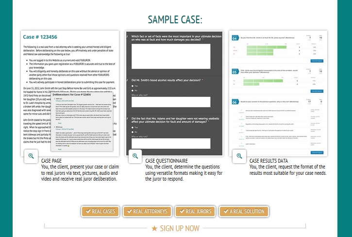
First, the example at the top of this post shows a new website we’re building which needs to feature multiple screenshots.
Putting pictures of white screens on a white background will absolutely not look good. Tom has added drop shadows to the screenshots for some dimensionality, and has also added cool little “look closer” buttons with their own shadows.

Josepha says this type of subtle, uniform shadow is more convincing than those that try to show the light as coming from one side or another, and she may be right. The effect is of a sheet hovering gently above the surface.
Three D
The Natural Fruit Corporation thought about using a flat image of the front of their product’s box, but even though it’s bright colored, it still comes across as an information sheet. Instead, the webmaster created a three-dimensional image. While this won’t make sense for a screenshot, it’s a great option for e-book covers, product packages, and similar things that could also exist in the physical world.

Like the drop shadows, this is simple for your graphics guy to accomplish. If you don’t have a graphics guy, you can use a tool like Boxshot or 3dEcovers.
Create a screen
For screenshots, you can create a screen. For a software company’s site, where we needed to show lots of screenshots, Tom created a suggestion of a screen by rounding the edges of the screenshot and using drop shadow to bring it out from the page.

1st Security USA has a new website, and Corey Trent dropped their screen shot into an image of an iPad. This is another nice way to make that screen shot more concrete.

The thing that all these solutions have in common is that they get that that bare information looking more like an object — like a sheet of paper, an electronic screen, or even a three dimensional object. It’s a straightforward way to add dimension and make that image stand out more clearly.


Leave a Reply