Your cart is currently empty!

A New Website for an Attorney
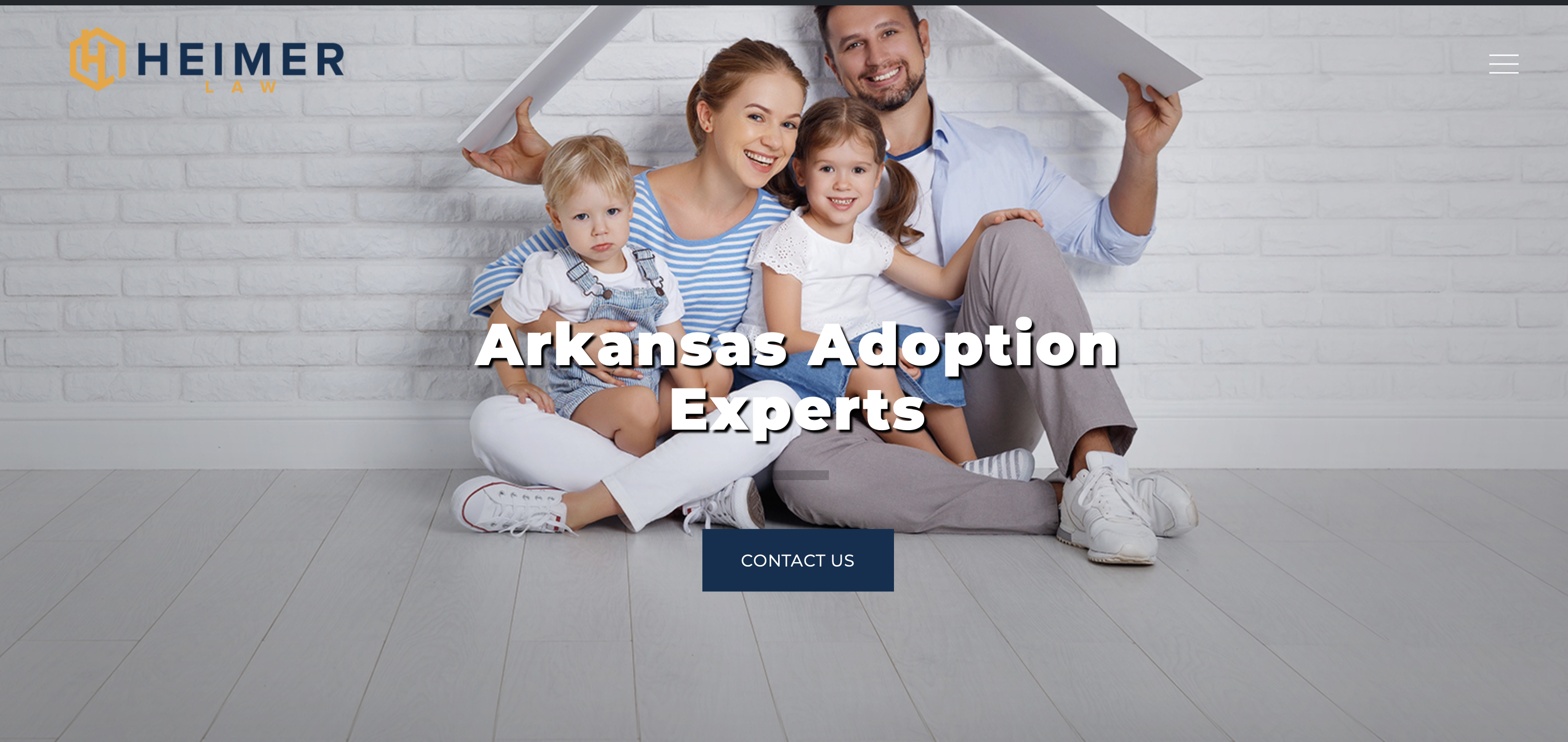
Haden Interactive is delighted to launch a new website for a long-time client, Heimer Law. This local attorney specializes in adoption, so the audience for the website includes several different groups.
- Women who are considering putting their babies up for adoption need to know the process involved and how they can gain access to services.
- Couples wanting to adopt a baby need to know what the process involves and how they can get started.
- Families wanting to adopt a stepchild, grandchild, or other relative need to understand their legal position.
Heimer Law wants to make sure they have answers to all the questions these audiences have.
The design
 The law firm came up with a list of websites they liked and we were able to identify some characteristics those websites shared.
For example, most of the sites used colorblocking with strong colors. The client was surprised when we pointed this out, but they love their new design with big blocks of color.
We created a new logo to go with the new design.
This part of the design process can be extremely valuable. If you decide to start with sites you like, here are some tips to make the process work well:
- Don’t limit yourself to websites in your own field. Your web designer can adapt the characteristics you like to your specific needs.
- You might not know what you particularly like about a website, but if you can tell what catches your eye, mention that.
- Include websites that make you feel the way you want your visitors to feel — reassured, excited, intrigued?
In the process of looking at lots of websites, you might notice elements that appeal to you even if the website overall does not. Tell your designer about those things, too.
With the client’s input, we were able to come up with a design that appealed to the site owner and also works well with their content.
The blog
While the clients weren’t immediately sure that they wanted to use the word “blog” at their website (they decided to do so in the end), they knew that their blog posts were actually bringing the most traffic to their website. An adoption – whether for the birth mother or the adoptive parents – isn’t an impulse transaction. It makes sense to have plenty of content for visitors to read and think about. It also makes sense to have plenty more content to help people during the long weeks and months of the adoption process.
So we put that content on the homepage. There are opportunities to contact the firm quickly, but also plenty of supportive resources. Since the homepage is built to show the latest posts, visitors can expect to find new content when they visit. However, we used the “sticky” function to keep the post the client wants everyone to see on the front page.
The calls to action
Heimer Law uses a special system for client intake. We linked eye-catching buttons to their off-site system, making sure that it was clear where visitors would be taken when they clicked the buttons.
There are also many opportunities to call, email, or fill out a contact form.
While we know that visitors may do a lot of exploring and thinking before they take action, we wanted to make sure that it is very easy to take those steps when they are ready.

This new website has a clear job to do, and it has been designed to do that job. It has a clear path to purchase for visitors, and shares the warm and caring tone of the firm.
We enjoyed building the site and look forward to seeing it perform well for the owners.
by
Tags:

Leave a Reply