Your cart is currently empty!

A New Website for a Preschool
We’ve built websites for quite a few preschools by now. The most recent is for a local school that serves families with kids from babies to kindergarten, plus summer programs for elementary school children.
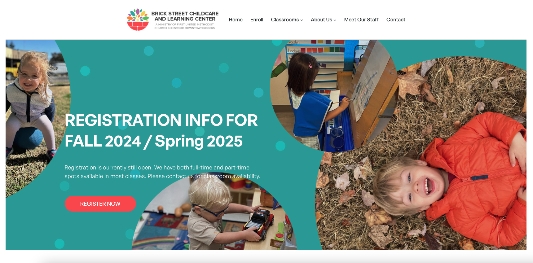
The school had a website which they had built in-house. It presented the information they needed to share, but didn’t show the character of the school as well as they wanted. It also needed some technical updates in areas like security and ease of use. We built a new site for them on the WordPress platform with their engaging photos and text.
The staff wants to manage their own site, and they are already comfortable with WordPress. We made sure that it’s easy for them to maintain the site themselves, with the option of calling on us for anything special they need.

Getting organized
We wanted to simplify the navigation and make the new site easier to move through. Analysis of their old site and discussion with the director showed that the most important organizational principle for the school was their classrooms. We added a grid of their classroom photos to the homepage. The photos are pulled in automatically from the individual pages for the classroom, so it’s easy for the staff to keep them updated in house.

Each of the photos in the grid is linked to a descriptive page for the classroom, and each classroom has a callout button taking visitors to their daily schedule.

There’s also a Classrooms page in the main navigation. This page explains all the different classes so parents can easily determine which class will be best for their child. This page also links to all the individual classroom pages.

With this central organization, we were able to use a simple navigation bar that includes all the other items visitors to the site might need to find quickly.
Design
We used the cheerful logo the school already had to set the colors for the website. Otherwise, we focused on their photos. We made sure that every image could be replaced easily with other images so the school can change them out easily without having to worry about fiddling with placement. The design showcases photo grids like the one shown in the Meet the Staff page below. The grid motif is also used to pull the blog posts onto the homepage.

The site is built with the Full Site Editor and designed so pages can be edited with either the Block Editor or the Classic Editor.
Function
Once you have the site architecture and the design settled, it’s important to make sure that your website has all the functionality you need. This website has a variety of features to make it work well for the needs of the school:
- A password protected page where parents can see videos from the school
- An embedded calendar that they can easily keep up to date from their phones
- Registration forms and employment application forms that can be downloaded directly from the pages
- An embedded map
- Analytics
- An email program
- An e-commerce set up that they can use in the future for T-shirts and other fundraising projects
While we often use electronic forms at school websites, they don’t fit into this school’s workflow, so we went with their preferred PDF forms. There are so many options with WordPress sites, you can always make sure that the website fits your office’s needs, instead of having to adjust to the website.
It was a pleasure to work with the Brick Street team. We expect that their new website will show up better in the competitive preschool space in their neighborhood.
by
Tags:

Leave a Reply