Your cart is currently empty!

A New Website for a Health Coach
We’ve created a beautiful new website for a Washington state health coach. Our client has been a professional chef for many years and is ready to add nutrition and alcohol coaching to her career path. Our goal was to create a website that would represent her in a very authentic and positive way.
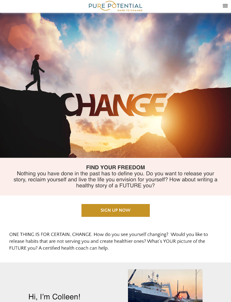
We built her site in WordPress using full-site editing and a basic block theme. We made a simple, friendly home page which pulled blog posts in from her blog page, which is shown below.

We know that a website for a health coach needs to give prospective clients confidence, so we included her impressive credentials in multiple places in the website. Sometimes business owners imagine visitors will read their websites as they might read a brochure or magazine, but people may enter your website on any page. As you collect data from visitors you can see the paths they take through their website, but a new website for a new business doesn’t come with that information.
We want to make sure visitors who enter via search or social media through a landing page or blog post will easily see the client’s certifications and diplomas.
Multiple audiences
Our client knew that she wanted to offer two different kinds of coaching, plus cooking classes. We knew that this could mean she would have three different audiences, so we wanted to make it easy for people who landed on her home page to find their way to the section of the website which would be most relevant to their needs.
The screenshot below shows the homepage, including the final paragraph of her introduction and an option to choose to view posts from three topics: wellness, cooking, and alcohol freedom. By clicking on their chosen topic, visitors can see multiple posts on the subject that is of most interest to them.

We also made certain that there was a landing page for each of her offerings. You can see the main navigation at the top of the screenshot above — it stays in place as visitors scroll.
Simple start
The cooking classes page continues with the same relaxed, friendly attitude, using simple blocks to present the planned classes.

While the client has a new business and chose simple calls to action to introduce her services, we built the website so that she can easily add e-commerce, affiliate links, or virtual products in the future. Building with future growth in mind helps to keep a website useful for longer.
We enjoyed building this site and look forward to continuing ng to work with this client.
by
Tags:

Leave a Reply