Your cart is currently empty!

A New Creative Website
A creative website? All our websites are creative, so what does it mean to talk about a creative website? Simply, the site owner is not a doctor or an engineer, but a creative professional. The Timothy Mooney Repertory Theater presents innovative variations on classic theater across the nation, bringing Shakespeare and Moliere — as well as Mooney — to schools, colleges, and communities in a fast, fun, and entertaining way.
We enjoyed working with their team to create a website that reflects their artistic vision. Our experience can be helpful to you if you are an artist in need of a website!
Make sure your artistic vision comes across
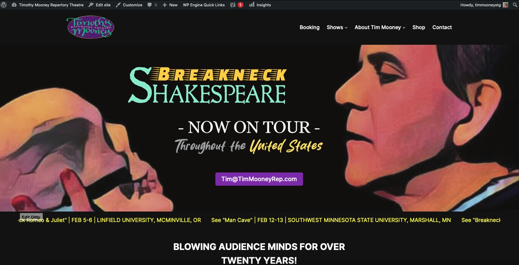
The Rep is a performing arts organization, but they have their own visual style. They provided lots of photos, videos, and illustrations use for their posters and books. They had an idea about how they wanted their homepage to look, and we were able to create that for them. If you want a particular look, make sure the agency you work with can handle it. Designers who rely on pre-made themes may not be able to give you the custom effect you want.

Each of the illustrations on the homepage is shown in a flip box. If you hover over it, you will see a photo from the show. The screenshot below shows the square for Breakneck Hamlet flipped.

Our designer had some ideas for ways to bring the other parts of the homepage into the overall design. We kept it lively and fun, in keeping with the brand.

Make best use of your assets
As a creative professional, you have goods to show your visitors. Make sure they show up on your website. For Timothy Mooney Repertory Theater, videos are key. Their YouTube channel has more than 500 videos.
You don’t need 500 videos on your website.
When you have plenty of great video, music, paintings, and what have you, curation is key. Make sure that your web team can choose the most engaging and appropriate elements for each page, or help them out by telling them what you want to use.
Interior pages for this website benefited from high quality, high resolution photos and illustrations. We let them speak for themselves and kept the pages simple. We used content from their existing website and optimized it for search. Clients who don’t already have plenty of good text will need to have that written. No matter how great your images and videos are, you need compelling text for the search engines and the human visitors alike.

If you have just a few assets to share at this point, try not to use them repeatedly. Instead, use the design and content to support them well in the right places in your website. Identify the areas you need to beef up and work on creating additional elements to add in the future.
Get up to date
At the same time that you keep artistic control over the presentation of your website, make sure you take advantage of what’s available in modern website technology. The old website for the theater company was built in iframes, with complicated options for buying play scripts and getting booking information. We were able to provide better tools for e-commerce and booking.
This is a WordPress site, so we can use plugins (a library of web functionality) and avoid custom development that can make a website costly and hard to manage. At the same time, we installed web analytics, set up a shopping cart using affiliate links, and added productivity tools like Edit Flow and Yoast.

Make sure that things like forms, shopping carts, and other functional elements work they way they should. There are myriad choices for this type of element, so there’s no reason to make do with something that doesn’t mesh with your workflow.
If you need a website for your creative endeavors, we’d love to hear from you. And don’t miss the chance to see Tim’s rollicking takes on classics at his website.
by
Tags:

Leave a Reply