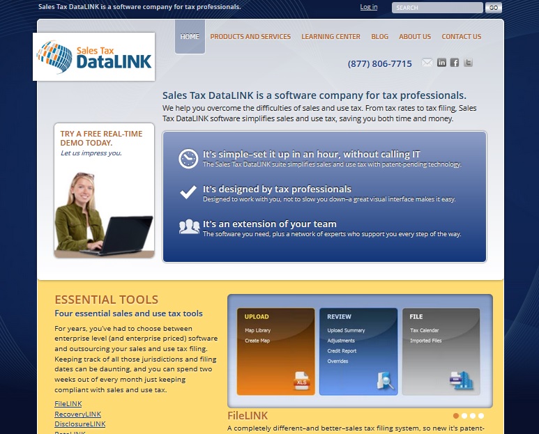
We’re polishing up a new website for a tax software company right now. Tom has created a home page that uses the color blocking that is one of the strongest trends in web design for 2013 (Josepha will be sharing the rest of her list later in the week).
Many of us have large monitors now, and the screenshot at left shows roughly what Tom sees on his monitor. The shot below right shows roughly what I see.
For me, the sliding gallery of screenshots from the software is only hinted at and the list of products is invisible.
A year or two ago this would have been an issue: only about 75% of users would scroll when they first reached a website, so the homepage had to have the important stuff above the fold. Once they reached internal pages, visitors were committed and would scroll, but the homepage was — as much as possible — complete above the fold. 
Now it’s not so much that people’s habits have changed as that there are a lot of possible folds.
People see your website on monitors and screens of various sizes, including the phone screen seen below left.
So it isn’t quite as useful to think in terms of a particular piece of screen any more.
It is still useful to make sure that everyone — regardless of their choice of device or browser — sees the most important things first when they visit your homepage.

For some visitors, what they see first is all that they will see.
That first thing should therefore be the information that answers the question, “Am I in the right place?” For business sites, that generally means a clear statement of what you have to offer and how visitors can get it.
Once visitors are sure that they’re at a website which can answer their questions and meet their needs, they’ll be willing to scroll, to click some links, or to read and watch information.
However you position your information and design elements, don’t forget that you need to communicate with the search engines as well as with your visitors. Without good rapport with the search engines, you won’t have as many visitors.


Leave a Reply