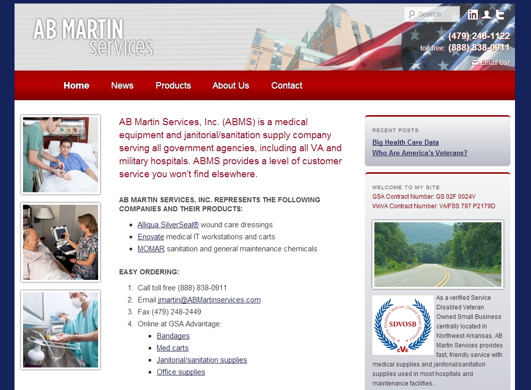
Here you can see a screenshot from a new website we’ve just launched. The site came with some interesting challenges. This site belongs to a medical supply company serving government agencies, particularly Veterans Administration hospitals.
The company doesn’t manufacture products, and they don’t have exclusive distributorship, so they’re basically selling commodities.
What’s a commodity? It’s an item that people want, but which they think will be the same no matter where they buy it. Eggs, for example, or batteries. You have probably never heard anyone say, “I’m going to get batteries from Store Y — they’re better than those at Store X, so it’s worth the extra drive” or “I like to get my eggs from that other grocery store, because they have a better selection.”
You have certainly heard people say they prefer one doctor over another, or that this wine shop has a better selection than another.
And yet there are reasons for people to come to you rather than to your competitors. How do you convey that with your website?
In the case of the medical supply company, we were able to identify three points that made this company different from others:
- They make a real effort to find and contract with innovative products.
- They offer an unusually high level of service.
- It’s a small family company, and the owners are willing to present themselves in that way.
Our challenge, then, was to create the simple website they wanted, and make the point that — in addition to hand sanitizer and scrubs — they have nanotechnology bandages and special medical IT carts. We also needed to make their website show the fact that they’ll treat their customers like family, and that their family is one that their customers can relate to.
We started with the navigation. Instead of dividing the products into Medical Supplies, Office Supplies, and Janitorial Supplies, we made separate pages for the very special products they offer.

We made sure that it was clear on the homepage that the company has 10,000+ products, but we want the website to compete in search and conversion on the basis of their special brand name products.
On the About Us page, we used family photos and family history the owner shared with us. We set up a News page, too, which has a relevant news feed brought in automatically, but which the owner can also use to share family news, what he’s reading, and other more personal items that will help to create a connection between the company and the customers.

Knowing the target market intimately allowed the site owner to work with us to tailor the message precisely.
Finally, we made some bold promises about the service customers could expect.

We didn’t use graphics, because the message is intended to be simple, direct, personal, and sincere. Obviously, this only works if it’s true. We put this message at all the decision points we identified, in different ways.
Determining the special things about the company and then using that information to inform the site architecture, design, and content of the website let us create a website that gets the point across. Your company can do the same:
- Figure out how you’re different from your competitors.
- Determine the kinds of words and images that will best express those differences.
- Make sure you get them into your website where people can see them.
I’ve always said that marketing is mostly about doing a great job and letting people know it. You can do that even if you’re selling a commodity, and your website can help you.


Leave a Reply