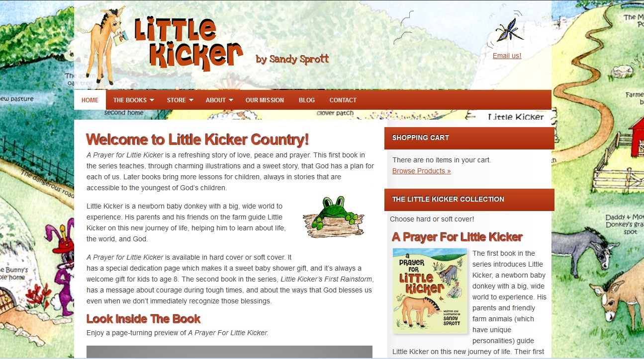
Here’s the new look we created at Little Kicker, a website for author Sandy Sprott’s children’s books.
You can see the “before” picture below.
Big difference, right?
But we didn’t redesign the site. Sandy had started with a DIY WordPress site with the Focus theme (a premium Genesis child theme from StudioPress). This is an intentionally simple theme. Sandy had added a small image from one of the books, and used the “title” function to add the name of the website.

We kept the theme, which had room only for a narrow header.
Sandy’s artwork is the centerpiece of the books, so we figured it should also be the centerpiece of the website. Designer Tom Hapgood used Sandy’s artwork to create a more distinctive header and saved it as a PNG file to keep the background transparent. He used Sandy’s landscape background as the background image (the old site at right used a tiled blue color swatch).
Tom changed the colors in the navigation bar and other page elements to match the color of the Little Kicker logo, and used the logo instead of a text title.

I reorganized the page elements to make it easier to order the books, optimized the content for search, and added a blog so Sandy can share with readers (and prospective shoppers).
A bit of updating for the widgets in the sidebar, stronger descriptions for the products, and the addition of some more of Sandy’s illustrations throughout the site, and we had a much more appealing website without a full redesign.
Will this strategy work for you? Here’s what you need, in order to make use of this strategy:
- Big, special images. There’s no substitution here. If you own original artwork as in this case, or you can use top quality stock images in a way that makes sense for your business, you can do this. Using snapshots or generic images won’t work.
- A simple theme. It’s not that you can’t use big images with a complex theme or with a custom website — it’s just that it requires more time and can quickly become a complete redesign rather than a quick update.
- Plenty of good content. Big images can make an eye-catching website without much content, but you’ll lose the search benefits. Sandy has an interactive electronic preview of one of the books, good images of the book covers, and lots to say to her visitors. The artwork provides a great background.


Leave a Reply