Your cart is currently empty!

Print and Web Together: Doing it Right
In the Bad Old Days of the internet, people often just grabbed the text and pictures from their print brochure and stuck it on their websites.
This doesn’t work well. People interact differently with brochures than with websites. They read them differently and respond to them differently. They have to be written and designed differently.
Once people began to realize this, they often ended up with completely different print and web materials — a website from a pre-made template, for example, and a stock brochure with completely different colors, pictures, and fonts. This isn’t the most cost effective approach, and it certainly doesn’t help with branding.
Start with your website.
Your website will probably be seen by more people than your print materials. If that’s not the case, then you need to work on your website.
You may start with a branding project that establishes your colors, fonts, and other visual style guidelines. If so, it’s essential to make sure that those choices work well online. So you might as well begin with your online brand.
Let’s assume that you begin either with a branding/ visual identity project that informs both web and print materials, or with your website. How can you use your web graphics and content to best advantage in your print materials?
- Use your logo. If you had a new logo made for your website, use it in your print materials. We’re amazed at how many people don’t think of doing this.
 Kansas City Realtor Ken Jansen let us create new business cards to match his new website.
 - Use your banners. If you’ve had banners made for your website, you’ll probably find that they fit well on business cards, postcards, and other rectangular print pieces. We make Moo cards with ours (Moo cards lets you back your business cards with lots of different images if you feel like it). This let us give leads a card that refers to the specific concerns they have. Sending someone a postcard can also be pretty impressive in these days of ever-decreasing physical mail. Once you’ve paid for a great design, there’s no reason not to use it in lots of places.
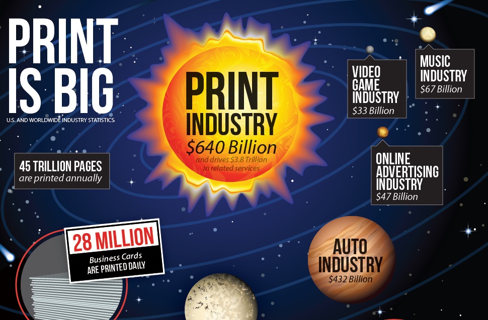
- Got an infographic? We’ve made infographics for several of our clients by now, as well as our own collection. Use them in your print materials and in your PowerPoint presentations. They present data in a fast and friendly way, and that’s never a bad thing.
- Use graphic elements from your website.
 We created bookmarks for More Than a Review that use the graphics and text we used on their website, along with some additional graphic elements and a layout that’s suited to the promotional pieces. The back has the logo and more text, but the front is designed to be pretty enough to make people keep and use it.
 - Don’t forget your QR code! Assuming that your website is the center of your marketing plan, as it should be, it’s always a good idea to send people there. QR codes work very well to send people to some specific landing page for a promotion or useful information; write something near it that will tempt readers to go to the website for more. Even if you use a QR code leading to your home page, add a line or two to lure people to the website.
It makes sense to start with your website. Usually, more people will see it, they’ll return to it more often, and it’s easier to update and change and test.
Once you have your website right, though, treat it as a great starting point for print materials. Direct mail may never again be your top marketing strategy, but it’s still great to put something in people’s hands when you meet them — or when you want to meet them.
by
Tags:

Leave a Reply