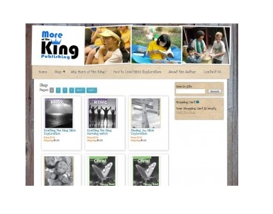
We’ve been working with a large-scale e-commerce site lately, and that certainly has challenges, but small e-commerce has its own challenges.
Here’s a website we’re getting ready to launch, a site with 20 products, not thousands of SKUs. This is typical of small-scale e-commerce sites, and it faces some typical challenges:
- How do you keep your online store from looking meager?
- How do you make the shopping experience meet customer expectations when those expectations are based on Amazon and Zappos?
- How can you be found by people looking for your products?
Laying out your store is important, since you can’t dazzle visitors with myriad products. Instead, you need to make your shop very browsable. As with flowers, the more you have the less you depend on design; it takes artistry to make a branch and a couple of flowers look good, but anyone can get a good effect with a couple dozen roses. Equally, if you have half a dozen products, you should plan on a nice layout to make your store look good.
WordPress is fantastic for small e-commerce, since plug-ins do a lot of the heavy lifting in terms of development. We generally use WP E-commerce, a free plugin with plenty of upgrade options. Designer Tom Hapgood styled the shop and the checkout options to make this little store look good.
A couple of the nice things:

A click on the item’s image on the Store page makes the image expand nicely. The visitors doesn’t have to click onto another page to see the product more clearly.

When customers do click through to get more information, they can still see their shopping cart as well as the main navigation for the website, and site search is also still available.

When they’re ready to check out, customers can check on shipping before they commit themselves, and they can easily change quantities or remove items — as well as finding their way back if they decide to do some more shopping.
The whole shopping cart is styled to match the website’s design, too.
While the programming for the shopping cart is covered by the plugin, it won’t look this way right out of the box. You need a designer to make it look this good. Tom has styled several websites for us with this plugin, and every store and shopping cart looks completely different.
The key? Think about usability. Walk through the experience yourself and make sure that you would be happy with the way the shopping cart works if you were a customer. Your designer is responsible for making the store look good. Tom is also very conscious of usability, but we know from experience that some designers are not. Know that there are alternatives, remember that your website may be art but it still has to function well, and be as insistent as you need to be.
Being found by people using search engines doesn’t depend on design. You need unique descriptions. Unique products would be even better for a small shop, since Amazon’s millions of pages and millions of backlinks pretty well guarantee that you can’t beat them on searches for products. If you have excellent content, you’ll be found by people looking for what you have, and they’re likely to buy while they’re there. Just be sure that what you have isn’t just a manufacturer’s description shared by you and hundreds or thousands of other websites.
Good design, usability, good content — sounds like a good website, doesn’t it? That’s the good news: the same things that give you a good website can give you a good e-commerce shop, too. Just make sure to apply them. Too many websites feel as though they put all the effort into luring visitors into the shop and don’t care what happens to them once they’re in the cart. This is part of the reason for high shopping cart abandonment rates.
Make the effort all the way through the shopping experience. Success will follow.


Leave a Reply