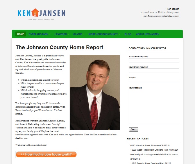
We’re working with Kansas City Realtor Ken Jansen on his new website. He’s not quite ready to have a custom site built, but he bought a specialized WordPress theme.
Haden Interactive builds WordPress sites with completely custom themes, and our designers may not agree with what I’m about to say, but I really like the way a good premium theme can provide functionality without bringing in a developer. Ken’s a Realtor, and building the back end functionality that would pull in house listings would not be on my list of fun things to do, so I like the way his theme — Woo Estate — takes care of all that for us.
I don’t like the way it looks right out of the box — you can see it on the left. I’ve written before about installing a WordPress theme . The Myth of WordPress is that you can pick a theme and instantly have a great website. As many people have learned, it’s not quite true. How did we make this example look good till Ken’s ready for a custom design?
Get a good logo.
Jay Jaro, our logo guy, developed a snazzy new logo for Ken. Many WordPress themes, including Estate, give you the option of using a logo or a text line. A good logo is going to make your page look more professional right away.
The logo will make a good starting point for Ken’s custom site, and of course it’ll look good on his print marketing materials for years. Spring for a professionally designed logo — you just won’t get the same results with that generic one from the quickie printer.
Use a static homepage.
If your website is a blog, plain and simple, you can have a homepage that just shows your posts. If you have a business, you’ll do better with search and probably also with conversions if you have some well-optimized text and a strong call to action. Estate lists recent posts below the main text, and we’ve also put Ken’s blog in the main navigation, so there’s no loss.
Plan your navigation carefully.
One of the most common problems with out-of-the-box WordPress themes is messy navigation. Ken’s spilled over onto a second line. We fixed it. Limit yourself to 5-7 main navigation items, and keep them short enough to stay on a single line. Lots of options, especially if they overflow and get visually messy, will frustrate your visitors, who want to find their way to their destination quickly and easily.
We also optimized the content, cleaned up the look of the pages, added pictures, and a bunch of other stuff that helps a site look good. These three steps can make a big difference, though. Give them a try at your DIY WordPress website and see.


Leave a Reply