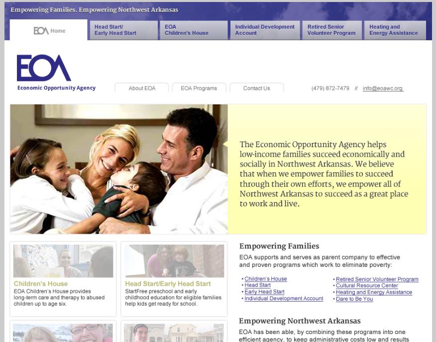
We’re working on a redesign of a local nonprofit agency’s website.
The agency needed an update for the sake of more current content and a fresh look, but the main reason they just had to have an update was that their old site was obsolete from the point of view of the technology.
This naturally happens to websites as they age. Technology changes, so having a very old website is like having a very old car, computer, or stereo. There comes a time when you just have to give up your 8 tracks, no matter how good they were when you got ’em.
The new site is almost ready (that’s a mockup of it at left), so I don’t feel bad about showing you some of the tech issues at their old site. Chances are, if you have an old site, you’ll find some of the same problems at your own website.
One of the biggest problems is having your text on the page as images rather than as words. Grab your logo, tagline, or other content with your mouse and try to pull it out of place. If it’s a picture, you can, as you see in this screen shot. The name of the organization is part of a picture. The same is true for their slogan. In fact, there are no actual words on this page at all. That means that search engines can’t read it — and neither can people using assistive devices like screen readers.

If your page behaves like this, it should be rebuilt. If you like the look of it, you can rebuild it to look the same, but it’s probably a good time to start fresh.
In the early days of the internet, text and pictures were put into their places with tables. This site was built with that technology, so when you load a new page, bits of it appear gradually. The screenshot below shows how the page looks as the different sections load.
You probably don’t know that your site does this, because you visit it often enough that you have a cached page on your computer. Use a different browser or a different computer to check your site and see if it behaves this way. If so, you need to have it rebuilt.
Another problem that often happens with older sites is that links get broken and pages disappear. This means that visitors get lots of error messages. In the case of this website,there were a lot of 404 messages, and they carried visitors off the website entirely.
The new website is highly usable for staff and visitors, attractive, and gives a much more accurate representation of this important agency.
You can easily update content (words and pictures) at a website, and you can sometimes tweak a design. If your site uses outdated technology, though, it has to be rebuilt. There’s no way to fix it without starting over, any more than you can fix an 8 track player so it will play MP3s.
Put your website through its paces and make sure that everything works for the new year. If you need a hand in doing that, call Julianne at 479.966.9761 and get on our calendar. We’ll be glad to help.


Leave a Reply