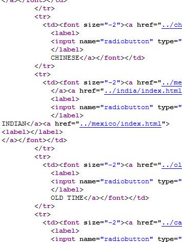
Try a little experiment with your company website. Go to it and click on CTRL+U or use View>Source to see the source code. Does it look like the example here, filled with “tr” and “td”?
In the early days of websites, all the elements on a page — words, pictures, everything — were shown to the visitor one after another as though they had been typed onto a piece of paper. The most a designer could do was to put a picture in the same line as text, as in the old website below. There was no way to put pictures and columns into the places where designers wanted them to be.
When a method of building tables was developed, people could put information into rows and columns the way you see information in a flight schedule or a TV guide.Clever designers figured that they could make big rows and columns and use them to put bits of pictures and text into the places they wanted.
It was a step forward for web pages.
Since that time, though, there have been a whole lot of steps forward for web pages. One of the most central concepts for web design now is that it should be semantic — based on meaning, not mechanics. That means that tables now are used only for making tables of data. The old idea of using tables to create a design for a web page makes websites that use it load slowly, behave unpredictably with different browsers, and communicate less well with search engines.
There are a lot of old style table-based websites online. If yours is one of them, it’s time for you to have your website rebuilt. You can’t know how many customers your badly behaved websites is losing you every day — until you have the updates done and see the results. Call us and get your place on our calendar for the new year.


Leave a Reply