Your cart is currently empty!

Charting Out Your New Website
Getting a new website made can be a heady experience, and the return on investment can be significant. But the process of getting from knowing that you need one to actually being online can be confusing.
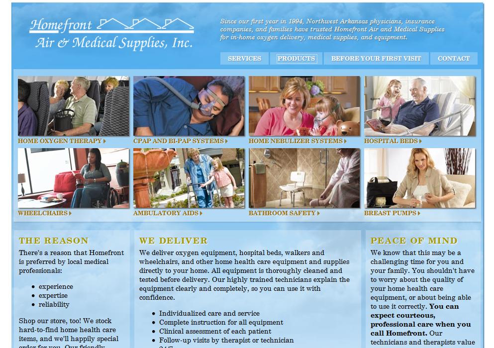
The example above is designer Tom Hapgood’s design for a site we’re building for a company that’s been around for a long time without a website. This is a local company, so we’ve been able to meet with the owner in person and discuss her precise needs and preferences. We’ve printed out physical documents for her and found things on her computer. We’ve helped her to envision how things will look onscreen — a difficult task if you’re not used to it.
What if you’re working with a company that can’t or won’t do this for you? How can you increase the chances of being able to communicate your needs the first time around and save on costly changes?
Try charting out your requirements ahead of time. Think ahead of time about your goals for your site, the mood and colors you want to use, and can show some examples of sites that appeal to you.
| Item | example | ||
|---|---|---|---|
| Name | Homefront | ||
| logo | use current | ||
| goals | authority | marketing | customer service |
| examples | site.com | example.com | example.org |
| colors | blue | pink | |
| mood | happy | reassuring | professional |
With this information, you’ll be ready to answer the questions your web professionals will have for you.
by
Tags:

Leave a Reply