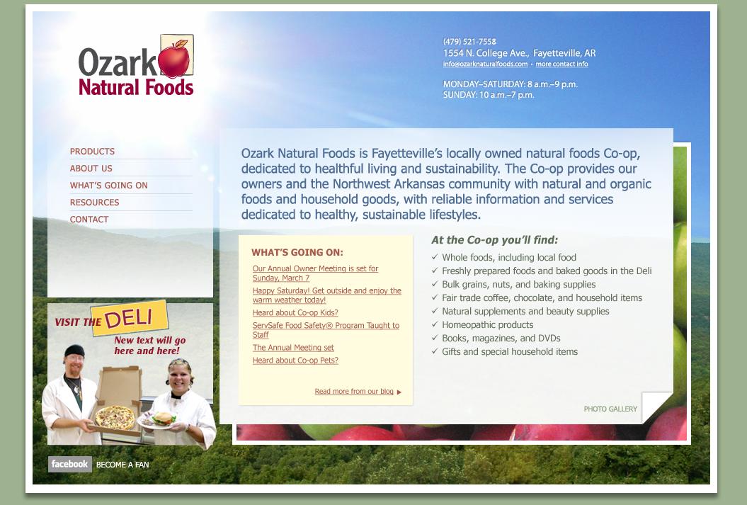
In building a website, you can begin with the content or you can start with a design (perhaps a template) and work from there.
Sometimes I write the content first and the designer fits the design around it. Sometimes the design is already finished, and I write to fit the design. If you hire your writer and designer separately, or you do some of the work yourself, then you have a choice between these two approaches. Which way is better?
Actually, both have advantages.
Content first
- Many modern design gurus prefer this. You start with the content, you mark it up semantically (“html” stands for “hyper-text markup language”), and then style the resulting html in the way that makes most sense for your content. There’s a logic to this approach.
- The content sets the tone. I wrote a content page yesterday for a jeweler’s site. While this was a credibility page, not even a main page, it took the client’s words and established a playful, informal feel which can guide the designer in the feeling of the site.
- The content can be part of the design. Clevertech is updating its own site. Owner Kuty Shalev and I worked out the primary text and sent it on to designer Jay Jaro, who will create an infographic including the text. “The point of an infographic,” says Kuty, “is to take a whole lot of information and make it digestible.” Here, the words will become part of that graphic, leading visitors to read more than they might without the design elements.
Design first
- The content will fit the design. Vivid Marketing just made a new design for an area medical professional. I wrote the content first — and didn’t know until after launch that the site had ended up with an empty page. Fortunately, we have access, so I was able to go in and write something for that page; if I’d written it for the client, he might have had extra costs involved in submitting it to his webmaster for changes after the site was up.
- The content can take the feeling from the design. Sometimes the logo, colors, and images are easier for a client to come up with than the feeling they want for their content. Once I saw the design planned by WhatIf Creative for the site they’re building for an area architect, I could tell the kind of tone the client wanted in their content, even though they hadn’t provided much.
- It can be an efficient way to work. iProv set up a site with spaces for the content, and I was able to go in and enter the text directly, instead of sending a text file to the designer to place. That can be a savings of time and money.
Here at Haden Interactive we have what I think is the very best arrangement: simultaneous design and content. We work together from the beginning, so the content and design work together perfectly.


Leave a Reply