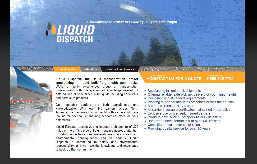
The good people at Liquid Dispatch, Inc. needed a new web design. Their website wasn’t coming up first for the name of their company at the search engine results pages, and they weren’t sure that anyone was visiting them. Their old site needed updating:
Designer Tom Hapgood used a lot of elements, like asphalt textures and a road map background, to suggest transportation, and a liquid droplet to symbolize the company’s specialization. The new look has a more modern look and feel, the navigation is better, and the code is up to date, but does this have any consequences beyond mere aesthetic improvement?
Notice the differences, from the point of view of the search engines:
- The new version has more content, with more important keywords in important places, so the search engines can more easily tell what Liquid Dispatch does. It’s still natural-sounding, and informative for the human visitors, but it’s going to be more visible.
- The whole new site is available to the search engines. The old site had sections that couldn’t be read by search engines at all.
- The part of the content that is just for the search engines is now more useful. The new site has analytics installed, too.
The new “about us” section is going to be important for human visitors, and therefore for conversions. Since their human visitors are looking for someone to transport petroleum products and liquid nitrogen and stuff across the country, reliability matters a lot. “About us” is the “you can trust us and here’s why” section. This company needs one. Fortunately, they have many strong “here’s why you can trust us” statements they can make. and even more fortunately, the content for this page can quite naturally be studded with their keywords.
Combining “contact’ and “price quotes” eliminates a stop-and-think moment for their visitors. All “Hmm… what should I do now?” moments have the possibility of making your visitors give up and leave instead of following through with the contact. A smooth path from first contact with your page to conversion is a must.
So the new page brings greater visibility as well as better responses from their customers.


Leave a Reply