Your cart is currently empty!

The Cute Website
I was working with a client the other day, and she expressed dislike of a paragraph I’d written for her because it was “too sweet.” Another phrase was “too cute.”
This was my fault, certainly. She had told me that she wanted sophistication and elegance. She just seemed sweet and cute to me, and some of that seeped into the writing.
This may have been exacerbated by the fact that I’d been searching for a designer for a client who wanted a really cute website. This client dresses up her dogs. She describes herself as having “blonde moments.” Nothing is going to be too cute or too sweet for this client.
I’m not cute, personally, nor am I particularly sweet. Kind, yes. A woman of integrity, certainly. Cute? No. But I have the advantage of having worked with elementary school teachers for years. At first, of course, I could hardly bring myself to say the word “Punkydoodles,” but over time I learned to enthuse over polka dot borders, and from that to personal cuteness is but a step. I may not be cute, but I understand cute.
Do you want a cute website?
Can you use a cute website for your business?
-
- Consider your industry. My cute blonde client owns a teacher supply store. There is nothing too cute for this business. She has Pajama Party Night at her store, when all the workers wear their jammies and the store stays open late for a sale. I know, most of you are having to sit down and fan yourselves right now. If you’re in an industry like this, though, you can be as cute as you want. Law office? Not so much.
-
- Can you spin cuteness your way? There’s flat-out cute, but there’s also ironic cute, retro cute, sassy cute. Still not right for a law office, but this custom apron maker can definitely get away with it.
Commit to cute
If you’re going to have a cute website, you’re going to have to follow through. Don’t go with a cute design on a momentary whim, or because a focus group said they’d like it, or because your friend/wife/a passing stranger admired it. Choosing a cute design (and really, one dressed-up dog, big-eyed child, or sparkly starburst just about pushes your site over into cuteness) and then going with businesslike language or a corporate style logo creates cognitive dissonance. The last thing you want your website to do is create cognitive dissonance.
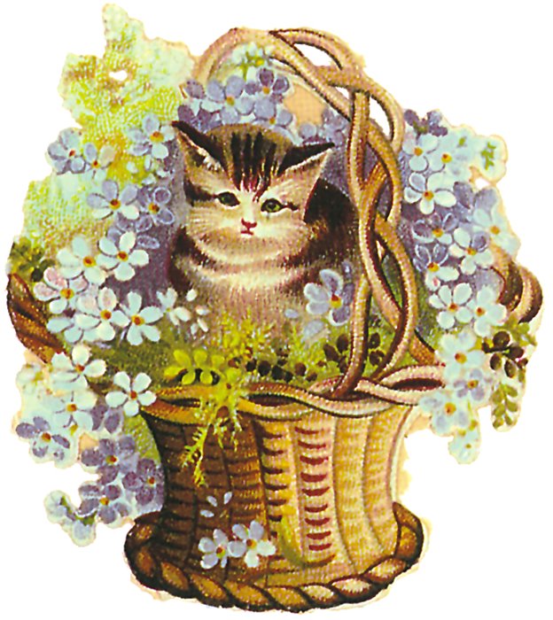
So, if you’re tempted by a pink web template or thinking that a kitten in a basket would make your site stand out among the other biohazardous waste solutions, think twice. Even three times. Then, if you really still love it, embrace your inner cutie and find a designer who can do the same.
by
Tags:
Comments
2 responses to “The Cute Website”
ITemplatez.com offers professional web templates, flash templates ,swish templates, dreamweaver templates, and other web design productsavailable for immediate download.
Jan, your website really needs editing — you have cute templates, but for the price of one or two of them you could get the English cleaned up and give a much better impression. The increased sales you’d get from the increased air of trustworthiness and professionalism would quickly pay for the expense of hiring a copywriter to make those corrections.
Hope you don’t mind the unsolicited advice!


Leave a Reply