Your cart is currently empty!

What’s the “About Us” Page For?
The “About Us” page on your website is one of the trickiest to plan. You don’t really want people to land on it first, so SEO isn’t the main issue. Conversion is central.
The essential thing is to understand how people use this page. Many times, “About Us” pages are written as though they were an extension of the homepage. Sometimes they duplicate the homepage. Often they’re a plain presentation of the company mission statement, or an echo of a book’s copyright page. I recently did a site analysis for a company that used the “About Us” page for a glossary. These sites are not making good use of the “About Us” page.
Unpopular but important
Make sure that it is.
About us content
Your “About Us” page is the closest you can get to a face-to-face meeting online. This is the page where you should put your staff or family photograph, your letter from the CEO to the customers, your two generations of experience or fifty years in the same location. This is the page for your sustainability commitment or community service information.
The people who visit this page may just glance at your picture and your signature and, reassured, move on to place that order or send that donation. But they may also be willing to stay and read all your details. Sometimes it depends on how much money and information they are contemplating sending to you. So you need a page which will send an immediate reassuring “You can trust us” message, but one which can also accommodate more in-depth content than you may choose to offer on other pages.
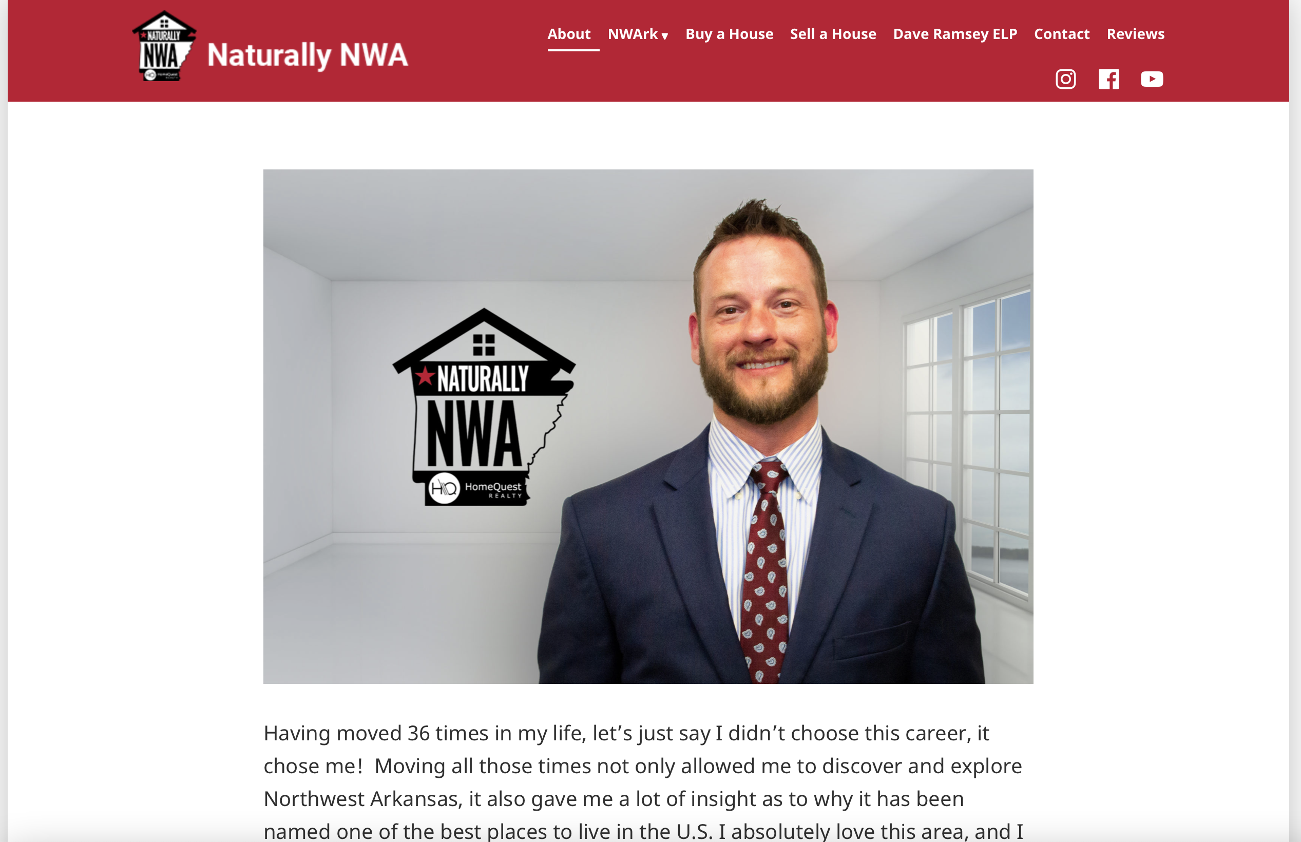
The example at the top of this page is from a new website we’ve just launched for a local realtor. He uses video to showcase his knowledge of the area and his likable, friendly personality, and the “About Us” page reinforces that. We used his own words for the text and a portrait of him for the image. Visitors can get a good idea of what the home buying or selling experience will be like with him.
Have a look at your own website’s “About Us” page. Does it serve its purpose? Does the content make your company sound human, likeable, and trustworthy? Does the design help your visitors travel through the page — and the site — in the most useful way? Giving your “About Us” page an update can make a difference in your conversions.
by
Tags:

Leave a Reply