Your cart is currently empty!

Your Website Mockup and What to Do with It
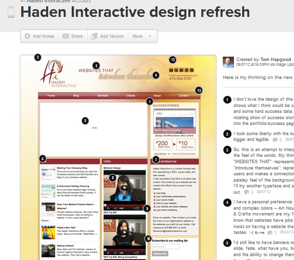
When you have a website built, one of the first pieces of work you’ll see is a website mockup. A mockup is a picture of a website showing the homepage and possibly an interior page. It’s a picture, not a webpage, so the navigation links won’t work. It might use your actual content — pictures and words — or it might have placeholders. It will show the entire web page, so it will include the part “above the fold” that visitors see when your website loads and also the part of the page they will need to scroll to see.
Here’s an example:

What’s a mockup for?
Your mockup shows the design of your website. Think of it as showing you the boxes into which your content will be placed. It will give you a sense of the colors and the overall feeling of the design. There can still be lots of changes before your website is built, but this is definitely the moment to say that you hate the color purple or that you don’t want to show products on your homepage.
Think of it as an agreement on the basic structure of your website.
These are things to look at and think about when you look at your mockup:
- navigation
- colors
- basic design, such as a stacked look or a classic hero image plus spotlight boxes
- overall aesthetic
- fonts
What is not important in a mockup?
The words in a mockup are nearly always just possibilities. We send a mockup to our clients and then we send a document containing the words. Some firms may send you a mockup but leave the words entirely up to you. Some mockups contain lorem ipsum or gray boxes instead of text. It’s safe to say that conversations about words are almost never what your designer expects when you receive a mockup.
Your mockup also probably doesn’t use the pictures your website will use. The example below uses a couple of men’s photos in place of all the pictures of team members which will be added later. If you look closely you’ll see that the words and logos are also not what will actually be at the completed website.

In short, your mockup is about the design, not the content.
Give feedback
When you’re looking at a mockup, you should feel free to move things around. Once the website is built, you should expect additional costs if you need to move things. This is definitely the moment to say that you don’t like the placement of the photos or that you want an edgier look. This is absolutely the right moment to say that you don’t like the design and want something completely different. Save the discussions about semi-colons for later, but speak right up about your dislike of symmetry or your preference for something more corporate looking.

You can print out the mockup and draw on it, describe the things you like and dislike, send a bulleted list of desired changes or issues, or use graphic tools to highlight the things you want to discuss.
Just be as clear as possible and make sure you and your designer are talking about the same things. If you say “folder” and they say “tab,” you may not have the same thing in mind. Never hesitate to ask for clarification: “When you say ‘image,’ do you mean ‘picture’?” is absolutely not a stupid question.
Iterations
If you ask for small changes — like leaving photos off the testimonials in the example below — you can just make a list. But if you want something quite different, you should ask for another mockup. Your contract with your web designer may say something about the number of iterations included in the plan. That’s the term for making a new design with a new mockup. You might have an agreement that you can have three iterations, that is, three versions of the design. If you need six iterations, you should expect additional costs. If there is no clause about the number of iterations, then you will not usually be charged extra for additional mockups.

After the mockup
For Haden Interactive, the mockup is the first thing we send a client after we’ve gotten a clear idea of what they want in their new website. Next we send the content. When both are approved, we build the website. There are other possible working arrangements. If you’re not sure what happens next, you should feel free to ask.
Check out our portfolio to see some other designs from Haden Interactive.
by
Tags:

Leave a Reply