Your cart is currently empty!

Medical Website Redesign
We built a website for a local physician’s consortium many years ago, and it has performed very well. At last, however, we reached the point where we could see benefits to updating, and so could the client. We’ve just launched their newly redesigned website.
Since this is a WordPress website, we were able to make big changes in design without losing or having to rewrite the very large quantity of content in the site.
Navigation

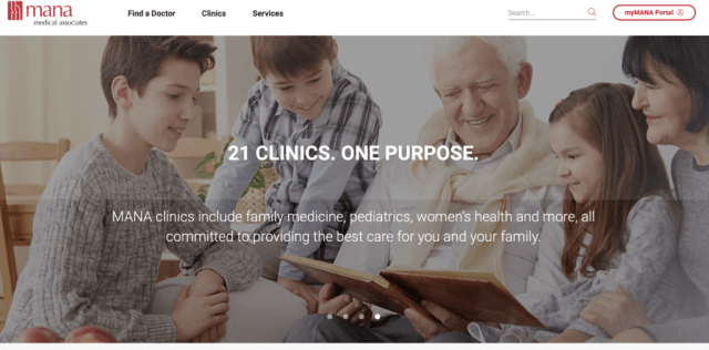
The first website we built had a welcoming home page, individual pages for the doctors and the clinics, and quick navigation to the patient portal and other pages visitors would need quickly. As the organization grew, the drop-down menus did, too. Over time, the navigation became unwieldy. This is a common problem for healthcare organizations.

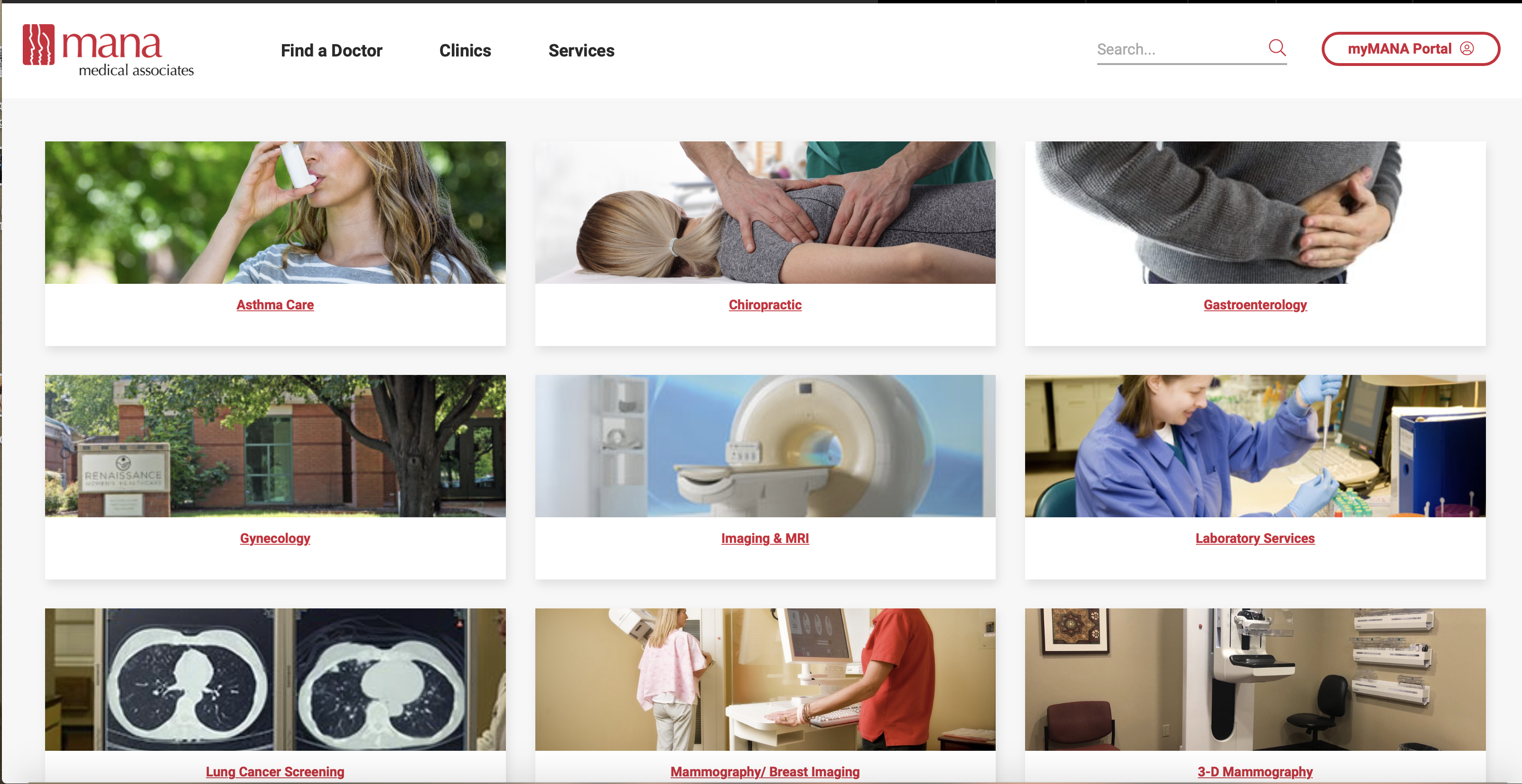
The new website has simpler navigation. Visitors can quickly go to the patient portal, or they can look for a doctor, a clinic, or a service. Each has its own page.

Each clinic page has its own blog posts and locations cards when visitors scroll down.

The Locations cards are gathered together on a “Find a Clinic” page that allows searchers to specify their town or to see all the clinics in alphabetical order. Each card includes basic information — address, phone number, and hours –and visitors can click through to the specific locations for more information.

The “Find a Doctor” page allows visitors to search for a doctor by clinic, specialty, or name. Each clinic also has a block showing their doctors, so visitors can click through from the clinic page to get more information on an individual physician.

Creative ideas about how to help visitors find their way around the website make it easy to travel through the site, even though it is a large and complicated website.
Multiple templates
The new website has a new custom theme, as the old one did. It also has a number of special templates for different pages. The “Find a Doctor,” “Find a Clinic,” and “Locations” pages all use custom posts.

Clinic pages have big hero shots with buttons for the things patients need quickly.

Lower on the page, there are visually interesting blocks with more information presented simply for comprehension at a glance.

Simple, clean layouts on other pages make it easy to read important information.

The blog page also has its own look.

Individual posts are styled for readability on mobile devices.
Custom posts

Custom posts create forms within the editor to make it easy for the site owners to make changes in-house when they choose to.
A number of WordPress plugins create custom posts. WooCommerce, for example, creates products for sale. IDX plugins create real estate listings. You may be able to find a plugin that makes custom posts of the type you need. If not, a skilled developer can set up options that are just right for your special needs.
WordPress is quite powerful.

This new website is designed with a number of different ways to put current news and important announcements on the homepage and on clinics’ main pages. This is important for the current pandemic, but will give versatility for the future as well.

 Download your copy of our free ebook.
by
Tags:

Leave a Reply