Your cart is currently empty!

Redesign for a News Site
Haden Interactive built a website for the Puerto Rico Report back in 2012. While the site has been very successful and has benefited both from our daily management and from a hands-on owner who collaborates well with us, there comes a time when a website needs a new look. Designer Tom Hapgood, the original designer on this project, came back to work on the redesign with us.
Here’s why Puerto Rico Report decided to go with a redesign:
- The original look, while still attractive, was no longer on trend. The client wanted a look that was in keeping with design trends for online news sources.

- The website has met its original purpose, and has added new goals. The new design works better with those new goals.

- Circumstances in the world have changed, and the focus content needed a major update.
- Data on how people use the website gave us new insight into ways that the site architecture could support visitors.
- Even though WordPress sites can be kept up to date much more easily than traditional websites, technology has changed enough that the redesign will perform better because of newer tech.
What’s new?
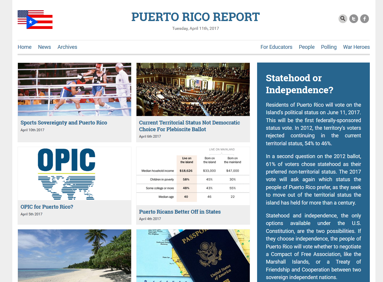
The Report has new stories several times a week, and — as is normal with news — some are old news fairly quickly. We know that many visitors treat the Report like a newspaper — they come daily to see the headlines and read new stories. We wanted to make sure that the news is immediately visible. Six new stories show up right away at the top of the home page. The client can make a post “sticky” so it stays at the top even as new stories are added, or we can simply add stories and know that the newest post will always appear at the top.
The Report also has lively discussions in the comments, with regular participants and new visitors holding lengthy conversations. We added a “Recent Comments” section so visitors could find those discussions more easily. We expect that this will help more visitors enjoy the discussions and make it easier for fans to find new exchanges they might otherwise miss.
We also know that there are some stories that clarify common confusions people hold about Puerto Rico, so we’ve stacked those core stories along the side where new visitors can easily find them.
The home page has a good quantity of text explaining Puerto Rico’s relationship with the United States. This will keep up the website’s excellent rankings.
We also added Featured Image functionality. Where the old home page had a carousel slider and a permanent design, the new home page relies on the articles’ illustrations to create a fresh new visual effect every day.
The site footer contains additional navigation items, Google custom search, the Twitter feed, and a newsletter sign up. We know that our visitors tend to scroll down, but we’ll monitor these items to make sure we’re not losing engagement.

Interior pages
Puerto Rico Report now has a new custom theme. One of the great things about WordPress is that design and content are separate. There is no need to migrate the content. Since the theme was built to suit the content, existing posts don’t have to be reconfigured to work with the new theme. This isn’t always the case when you simply switch to a pre-made theme. You may find that you have to do a lot of configuration and formatting to make your old content work well with your new theme.
For the Report, the new post design is simple and clean, with high contrast and plenty of white space around the featured photo. It accommodates the longer titles the site owners prefer, encourages social sharing, and shows the most recent comments in the sidebar.

Pages like the About Us page, which are not intended to be accessed primarily by search, have short text. The footer provides additional content and a call to action for these pages.

The process

It can be hard to understand the value of a custom website compared with a DIY drag and drop website. Both can look good, and without the data to determine whether one performs better than the other, it may be hard to see the difference in the value. Tom and I did our research and brought our ideas to this whiteboard. It doesn’t look like an important step, but it’s essential if you want to make sure that your website meets the needs of your visitors and the goals of your organization.
by
Tags:

Leave a Reply