Your cart is currently empty!

New Patient Pages
A website for your medical practice may be a tool for streamlining your practice, a way to provide additional value for current patients, or a home for your electronic patient portal. But it’s also a way for new patients to find you.
There was a time when new patients typically found out about healthcare providers by looking at a list from their employers, and the HR department facilitated the process of bringing in new patients. That has changed. Millions more Americans have health insurance now and are looking for healthcare providers, and many of them have limited experience with the healthcare system.
More than 80% of U.S. internet users look online for health information, according to research by Google, and 86% look online before scheduling an appointment. Most look first for general information, and then narrow their search down to a specific doctor or healthcare facility, rather than looking first for the name of a doctor or clinic. This means that they reach your website as a stranger.
You need a page for your new patients.
Where should you put your new patient page?
One of the big questions is where your new patient page should live on your website. Certainly, you could put it into the main navigation. However, you don’t want more than 5-7 options in your main navigation, and medical websites often have a hard time keeping the numbers down.
Including new patient concerns under another tab can be an option when there’s a lot to put on the home page:
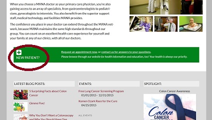
We tend to put a call out on the home page to help new patients find their way to what they need, as shown in the screenshot at the top of the post. For MANA, a doctor’s consortium which provided the first three screenshots on this page, we also had large, immediate links to the first two things on a patient’s mind:
This approach ensures that new patients cannot get lost, even though there is simply too much content in the site to make a new patient’s page part of the main navigation.
If you must put your new patient page under another tab and you don’t choose to use a home page call out, as the randomly chosen screenshot below shows, make sure you have carefully thought through your patients’ path to purchase and provided a clear path through the website. In this example, the practice assumes that their new patients will go through Services and then Locations before needing new patient information. This seems surprising.
When we explored the web looking for the most common placements for new patient pages, we were surprised to discover that they were often very hard to find. Gideon said that he sometimes found the pages after clicking all over the site, but was unable to get back to the pages easily after following links.
At the very least, we have to say that it should be easy to find new patient pages.
What belongs on your new patients page?
This page for a private practice includes a “welcome” message for new patients, a list of services, and contact information. This is to a large extent a marketing page, letting prospective patients get to know the practice and make sure it’s a good fit.
New patient pages also often need to give information and to offer packets of forms to fill out before an initial visit.
“What to expect on your first visit” is also useful — and in some cases necessary, if patients must prepare for their visit or might be nervous. Insurance information is one of the keys, as well; in fact, “do you take my insurance?” is the most common top question searchers have in mind when they visit a medical website. Payment policies are also very helpful.
Have we left off one of the things you want on your new patient page? Let us know in the comments!
by
Tags:


Leave a Reply