WordPress has some real advantages for medical professionals:
- You can have functionality like automatic appointment setting and online bill pay options without spending a fortune.
- Frequent updates are practical, either in-house or economically outsourced.
- You can easily add patient education options to your website with a blog, videos, or feeds from other sources.
We love to build custom WordPress websites and naturally we see the advantages of a custom site, but there are also some great pre-made themes out there for health care professionals. Here are a few that we like:
Panacea is a snazzy, modern medical theme from Themeforest. It’s fun to scroll through, and has plenty of color choices right out of the box.
![]() It has a slider, photo gallery, snazzy charts and graphs and maps and forms, and a lot of flexibility in page layouts.
It has a slider, photo gallery, snazzy charts and graphs and maps and forms, and a lot of flexibility in page layouts.
You can have the trendy stacked look as shown left, with some fancy parallax scrolling, or you can set up each page of the site with a single above-the-fold template from the array.
This theme will look great if you have lots of great photos — otherwise, it’s not going to be your best choice. Themes that rely on great photos are very disappointing if you try to implement them without those photos.
Another Themeforest offering, Medicenter has half a dozen different homepage layouts, including one with a small slider gallery. It focuses on blog or news posts, showcasing patient education opportunities as well as practice timetable options. It has a very simple appointment request form and good social media integration.
The timetable feature means that this could also be an excellent theme for physical therapists, counselors, gyms, and other practices that hold workshops, classes, or clinics.
If you’re going with blogging as a strategy to grow your practice and add value to your website for current patients, this is a great choice. If that’s not your focus, this might not be your first choice.
This offering from Nice Themes is very simple; of the options here, it is probably the one most likely to look good if you try to implement it yourself. Interior pages are set up to place images for you automatically, and to create a tidy page of excerpts without any effort on your part.
You can have a single page with just the basics — hours, services, doctors, map, and contact form. You can also add a blog, patient testimonials, and of course any customizations you or your designer care to make.
Tesla Themes has created a stylish theme with flat graphics that will make the site look good even if you don’t have a lot of photos to work with. There are some neat features, including a timetable showing available appointment times, newsletter signup, and social media integration for individual doctors.
This one is good if you like the look out of the box — customization options are limited — and don’t mind having your website look a lot like every other Medpark website.
Themeforest reached out to share a new medical theme, Medicals. It has a lot of nice bits and pieces: a snazzy map, a schedule, a nice staff page layout with social media integration for individual team members, an attractive schedule, Pinterest-style blog grids — a bunch of features, in fact, that we’ve created in custom themes recently.
As with any robust theme, you’re trading ease of use for power, so this wouldn’t be your best option if you want to install the theme and go, but it can certainly give you a lot of flexibility if you have the skills.
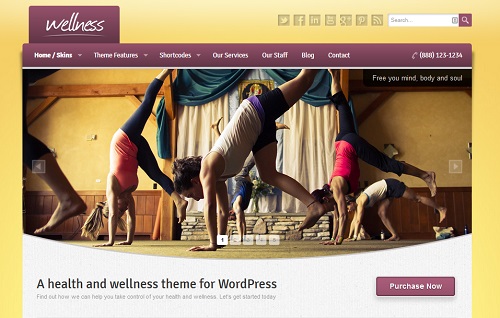
We’ve showcased themes that are designed for medical practices and have a recognizable medical look, but that’s not all that’s out there. Wellness, at the top of the post, has a variety of looks that could suit a veterinary clinic, a yoga studio, or a spa just as well as a traditional doctor’s office.
As with any WordPress theme, you may find that you need support with implementation, customization, and content in order to get the best return on your investment. Call Julianne at 479.966.9761 479.966.9761 for help.


Leave a Reply