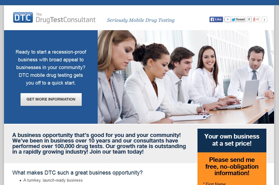
When you check your landing page report at Google Analytics, you’ll see the pages through which people entered your website. Chances are your home page will be the top choice. When you build a landing page, you’re doing something quite different.
A landing page in this sense is a separate sales page outside of your navigation, to which you will send people from an ad, a QR code, or another type of intentional link, usually for the purpose of selling them something.
So what makes a good landing page?
- Simplicity is key. Your landing page should sell just one thing. Sign up for an event, buy a starter kit, download a white paper — whatever the action you want your visitor to take, it should be simple and clear.
- Strong visual presence is essential. The call to action should stand out, and the colors and images should be eye catching. A video or a large photo may be the centerpiece of your landing page, but keep the overall design simple and avoid distractions.
- Calls to action are a must. You should have an immediate, obvious way to convert as soon as visitors arrive, but you should also have additional calls to action — for the same thing — lower on the page for people who need more persuasion. Conversion should be very easy: a few fields on a form or the click of a button. You shouldn’t dump your visitor back into your online store unless “Shop” is the call to action.
- Capture information. Your landing page should do everything possible to persuade visitors to share their contact information. This is the exception to the “Sell one thing” rule. If you can get contact information for people who are leaving the page — perhaps with a free download or newsletter offer — then you should.
- Persuasive copy belongs in several spots. First, there should be a headline to grab the visitor’s attention. It should be just what the ad or other link they clicked led them to expect. That is, if your visitors click through from an ad promising “Clearer skin in 21 days!”, the headline should be about clear skin, not about your entire skin care line. There should be a clear call to action immediately visible for people who are ready to buy — and then a good quantity of persuasive copy with facts and social proof for those who need more time to make up their minds. Finish up with another call to action.


Leave a Reply