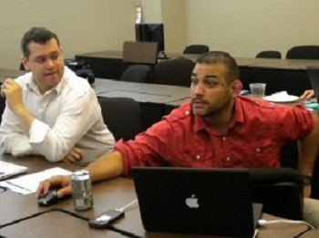
In truth, the only new thing I learned at NWAGiveCamp, the charity web site and app build-off that took place in Bentonville over the weekend, is that Ruby on Rails tells you exactly where you’ve made an error. I feel that this information won’t be very useful to my readers, though, so I will instead offer you a list of things I was reminded of:
- Angela Belford reminded me that it’s good to have someone in charge. A group in which everyone is sitting back hesitating to seem bossy has a hard time getting anything done.
- The numerous developers grumping about having to use WordPress reminded me that whatever is most familiar will be the easiest and most satisfying to use.
- Beau Poynor reminded me that people who are open to new things have the opportunity to learn more and develop familiarity with things that could well turn out to be something they’d like in the future.
- Brian Neumeier, who uses PaintShop on XP, reminded me that old familiar things can continue to be useful, thus completing the circle of viewpoints on new experiences vs. the lure of the familiar.
- Beto Ticono reminded me that the proportions of an image can make a big difference in how good it looks on a page.
- Ryan Ferreira reminded me that troubleshooting problems can go way beyond the page where you see the problem.
- Sean Borsodi reminded me that designers don’t usually make page elements 941 pixels wide. There’s a good reason for using fairly standard sizes.
- Karen Strain reminded me that people’s emotional responses to websites are as important as the things we usually test for.
- David Hecksel reminded me that it’s fun to work directly with other people, even if it takes longer.
- I was also reminded repeatedly throughout the weekend that without designers, the web (and perhaps the world) would be a much less beautiful place. Don’t let anyone tell you that designers are frivolous or unnecessary.


Leave a Reply